HiProMine
Home page design, 2025
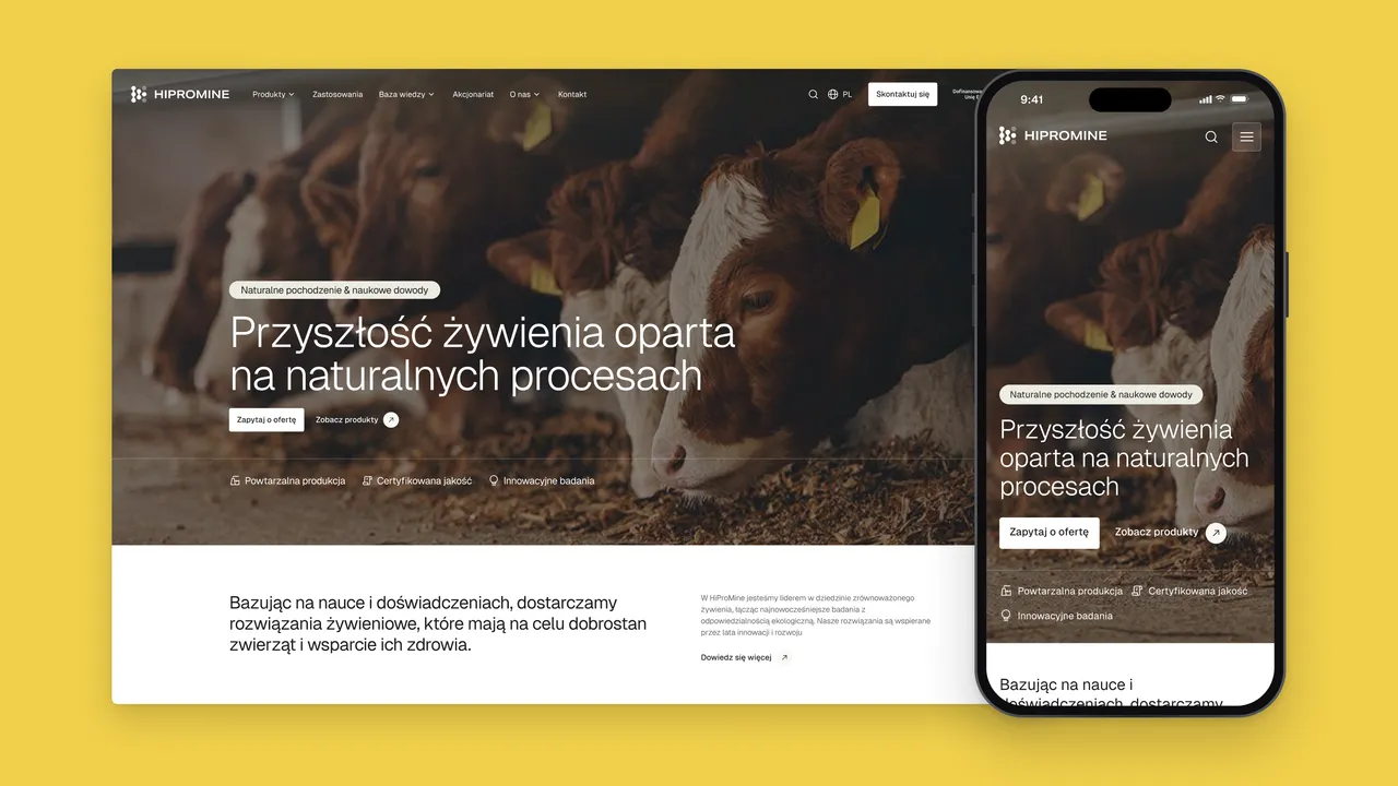
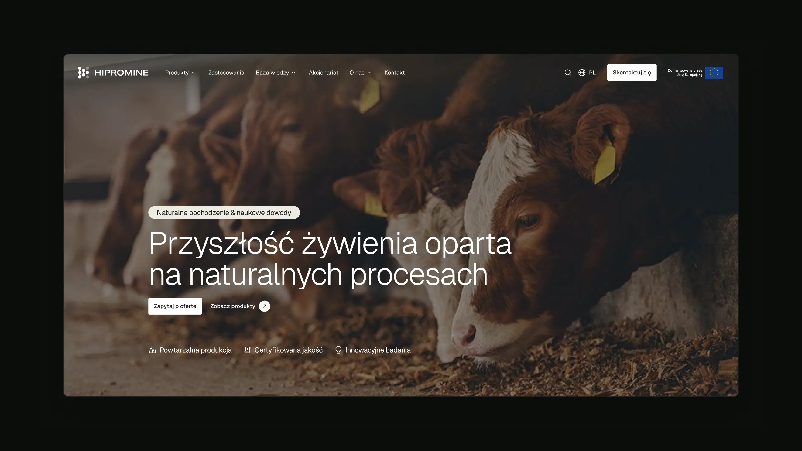
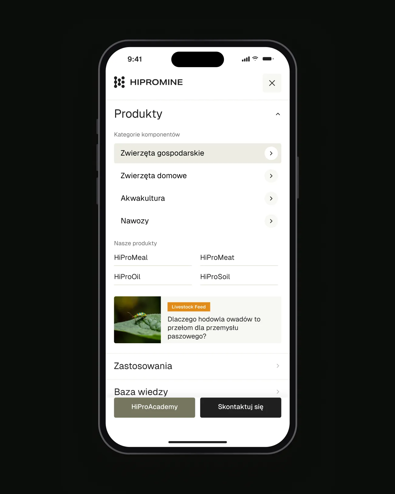
HiProMine produces insect-based feed ingredients and fertilisers from black soldier fly larvae. I designed the home page of its website, built on the brand identity by Brandma, with a mega menu that guides farm, pet-food, aquaculture and crop buyers to the right product by the animal being fed.
01 — Context
Insect protein for feed and pet food
HiProMine, based in Robakowo near Poznań, turns larvae of the black soldier fly, Hermetia illucens, into functional feed ingredients: HiProMeal, HiProOil, HiProMeat, HiProLarvae, the HiProDried Larvae range and Umami Boost, as well as the organic fertilisers HiProSoil and HiProFrass. Its customers are producers of feed for farm animals, birds and fish, pet-food brands and crop growers.
02 — Challenge
One raw material, many markets
The same insect-based ingredients are sold to very different buyers. A pig farmer, a fish-feed producer and a pet-food brand ask different questions and use different words, but a product-first navigation would force all of them through the same list of HiPro names. The site needed to start from the buyer’s animal and only then introduce the products that fit it.
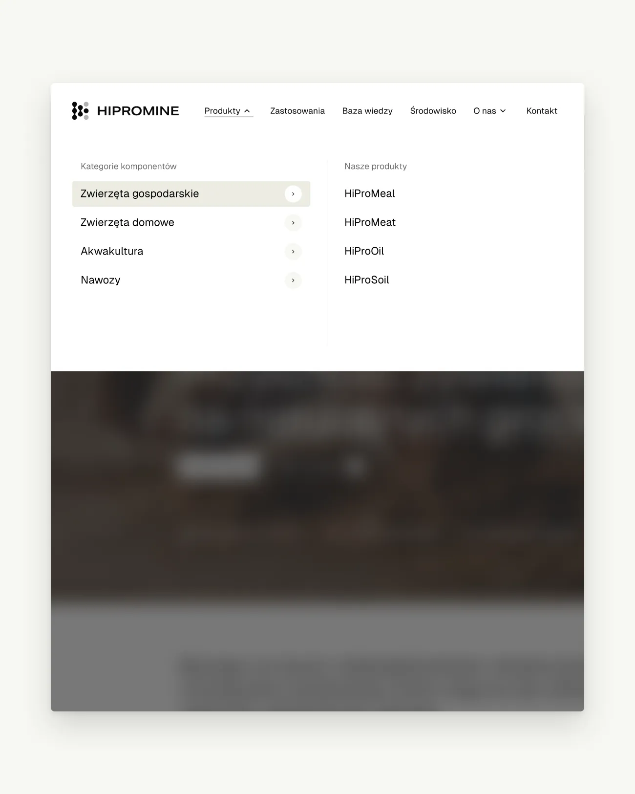
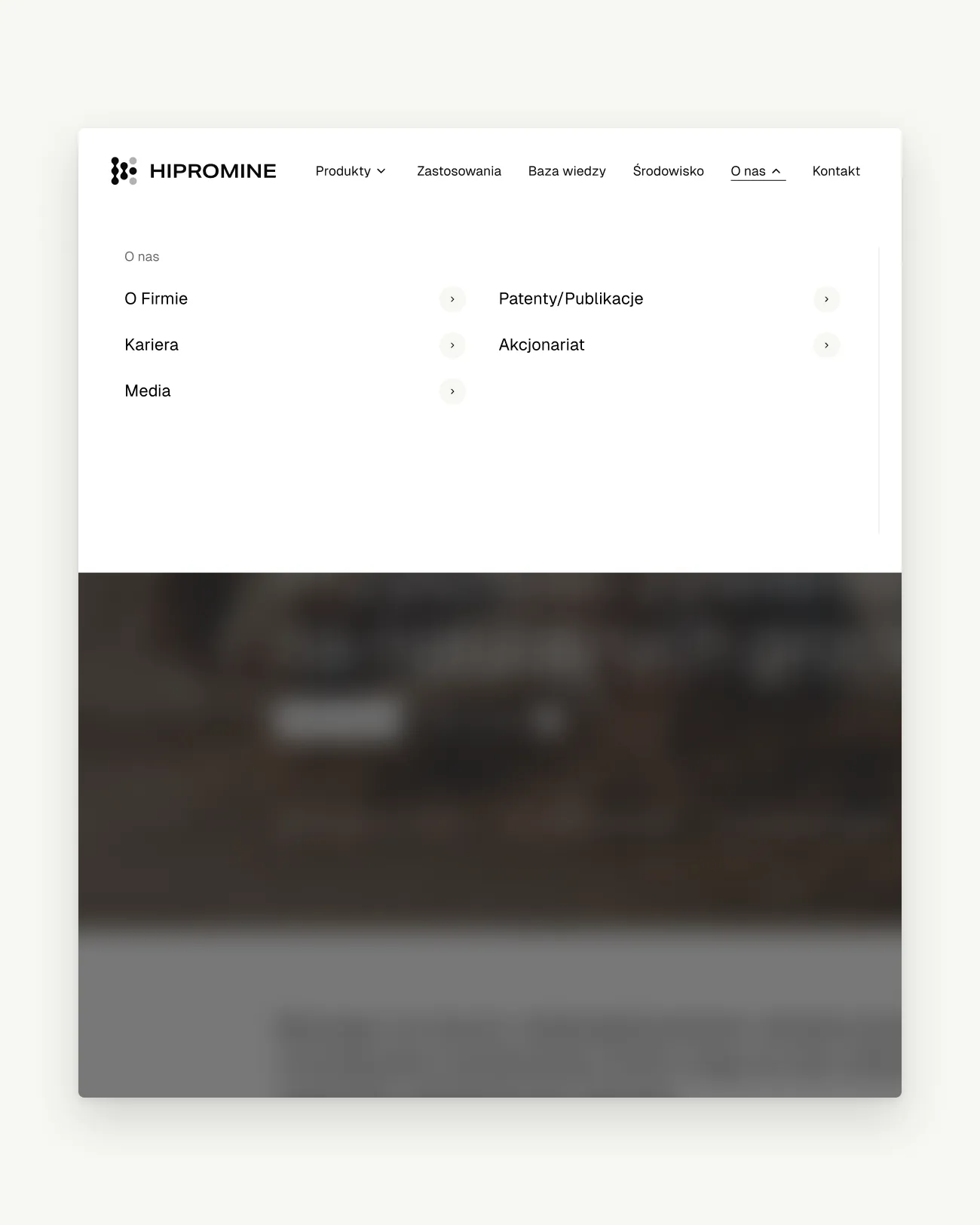
Start from the animal being fed, then introduce the product that fits it.
03 — Approach
A mega menu organised by animal
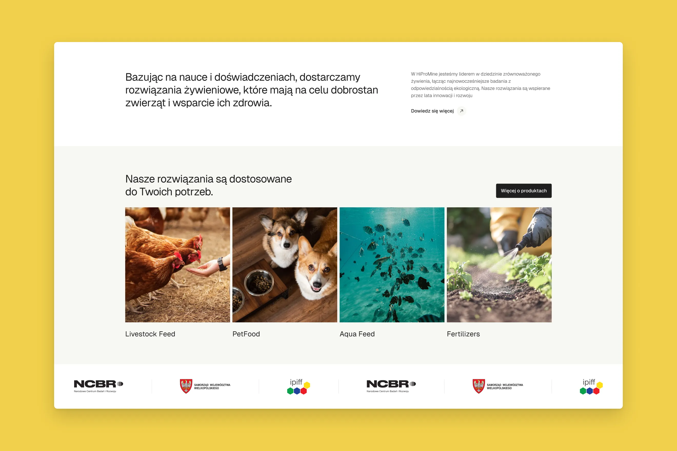
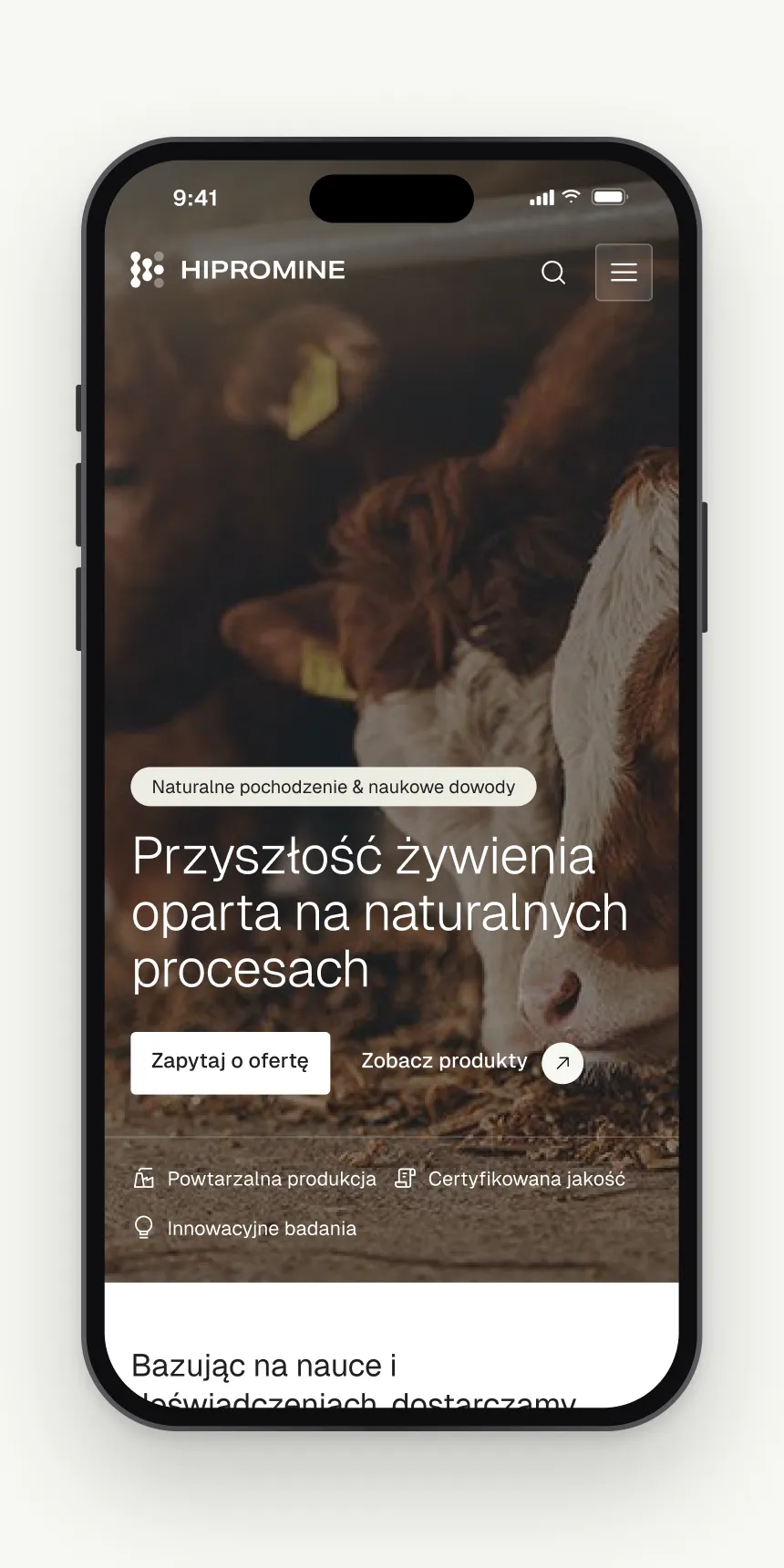
I organised the Products mega menu by who is being fed: farm animals, pets, aquaculture and fertilisers for crops. The panel lists the products next to the categories and adds the newest articles from the knowledge base, each tagged with its market. It drops as a white sheet over a dimmed page, so the lists stay readable over the hero, and the home page repeats the same four markets as photo tiles. A mobile adaptation folds the same groups into an accordion.
04 — Deliverables
What the design covers
- Navigation
- Products and About us mega menus
- Home page
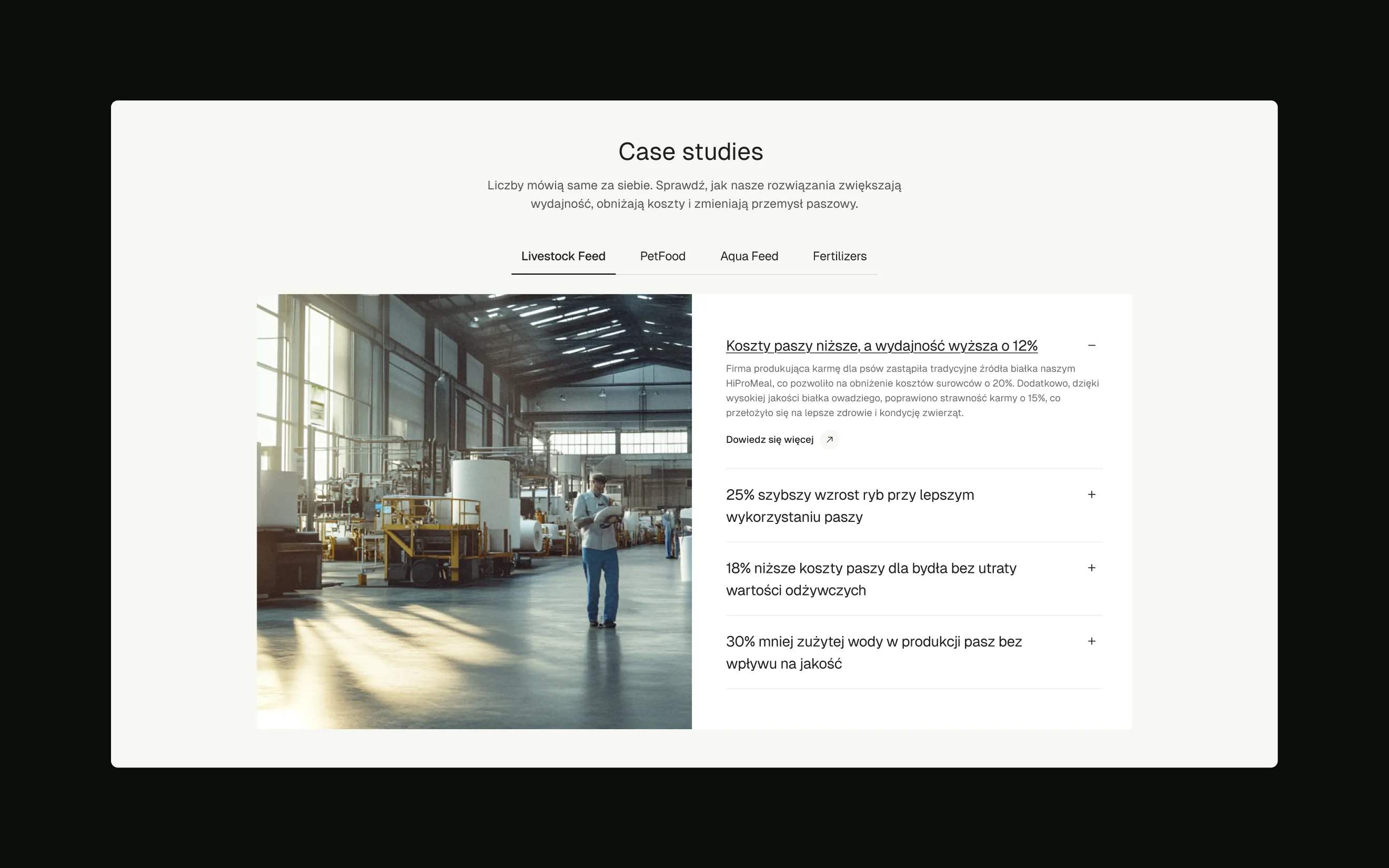
- Hero, markets, benefits, case studies, products, articles, FAQ and contact
- Components
- Buttons, navigation, menu items, product and article tiles
- Mobile
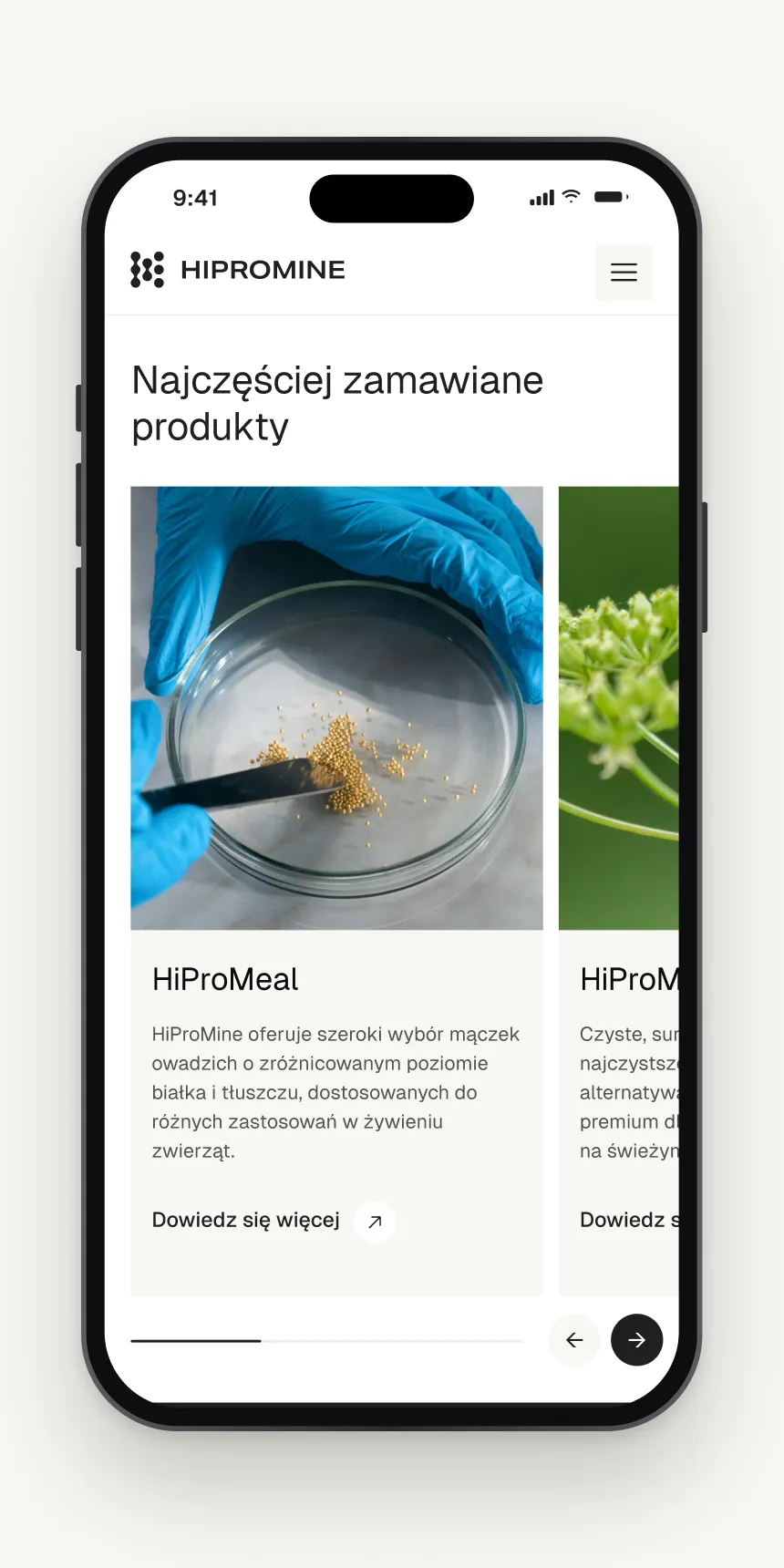
- An adaptation of the home page for phones
- Platform
- The site runs on WordPress, in Polish and English
05 — Details
Science, made approachable
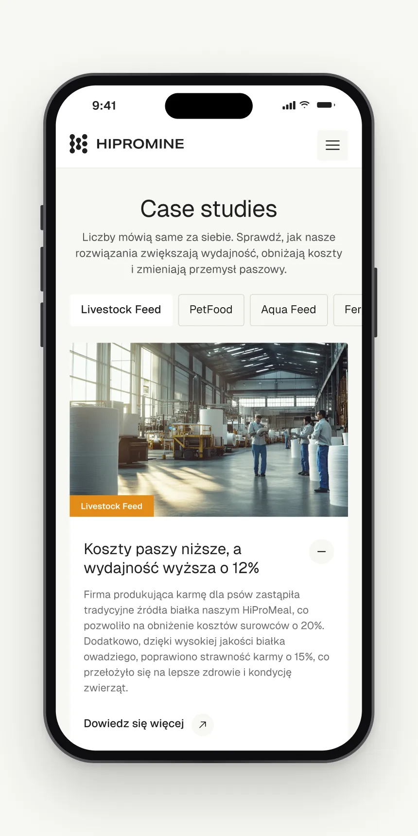
The subject is technical and the product looks unusual, so the home page leans on animals, fields and the product itself. Warm off-white sections, large light headlines and thin line icons keep a long page calm, while soft hourglass and circle shapes from the brand identity sit behind the benefits. Articles and case studies carry a coloured tag for their market, so a buyer scanning the page spots their own animal first.
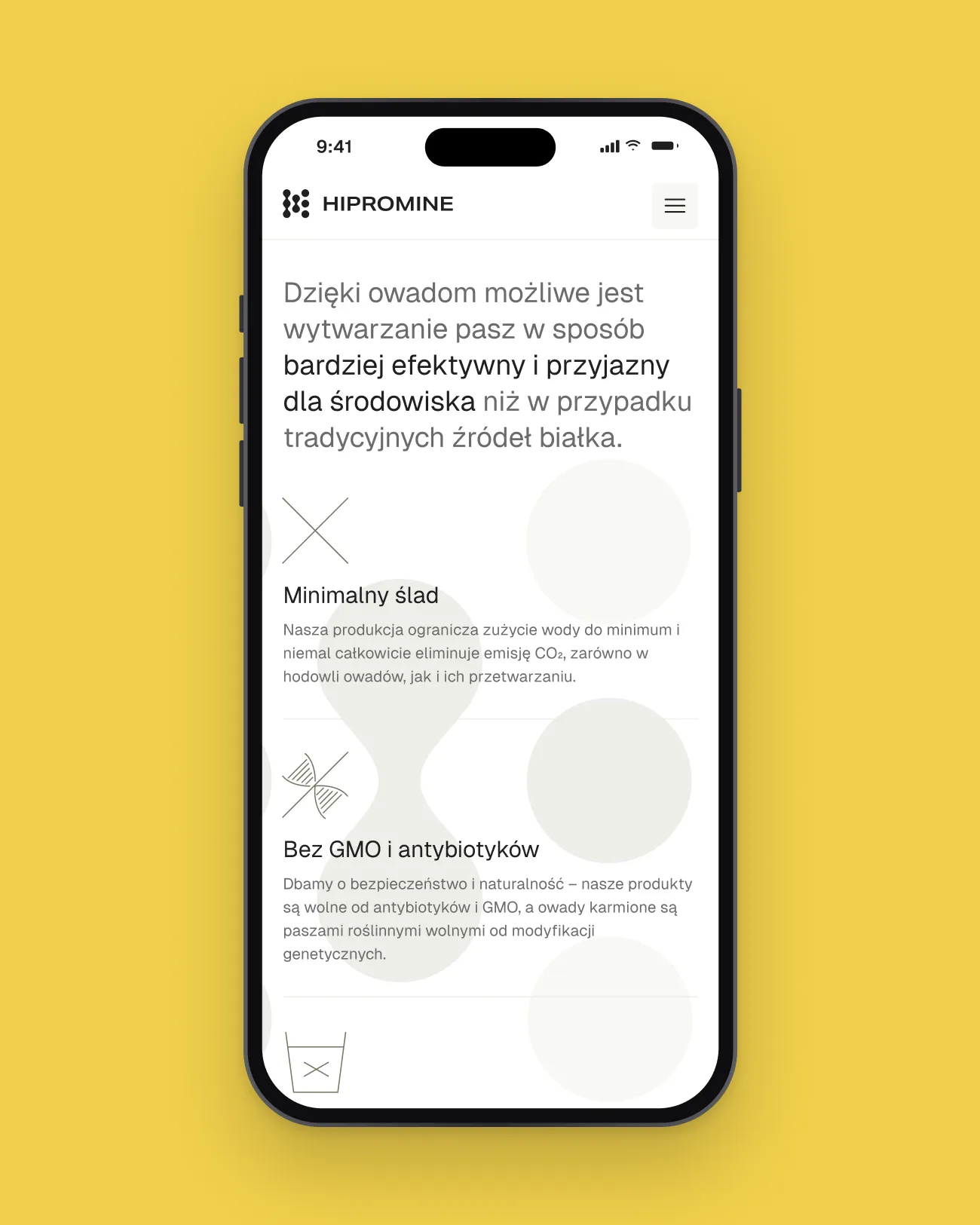
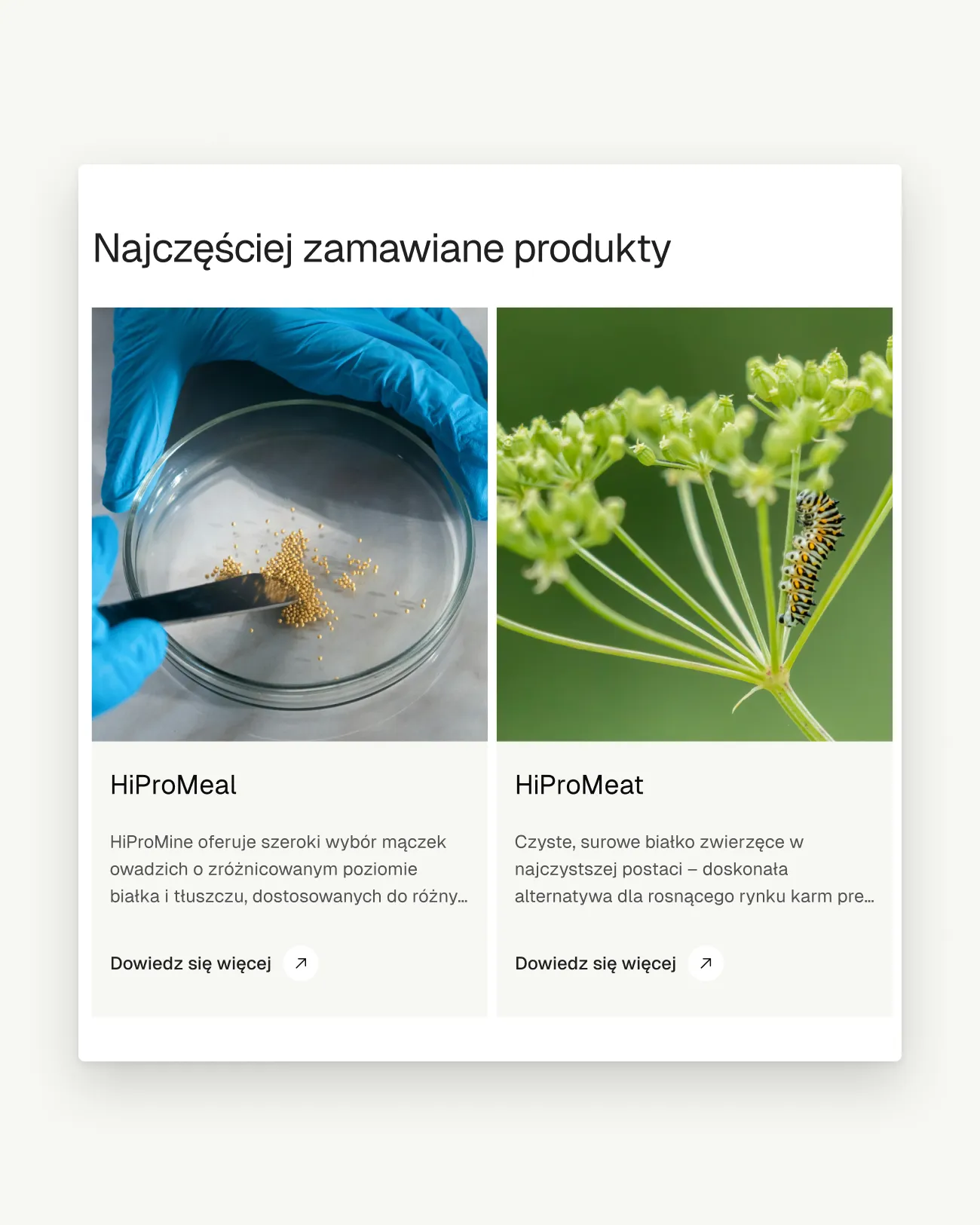
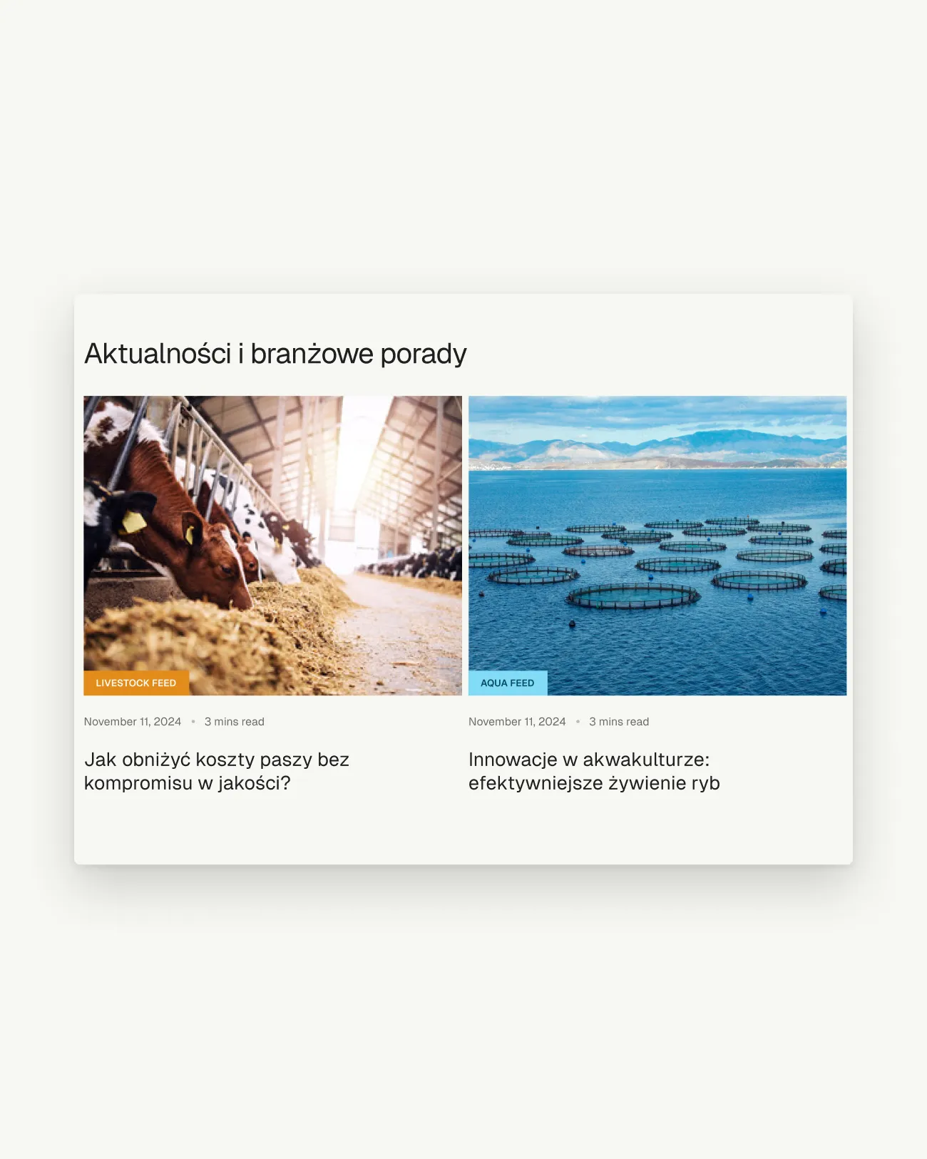
Products, articles and contact sit one hover away from the buyer’s first choice.
06 — Outcome
Every buyer finds their animal first
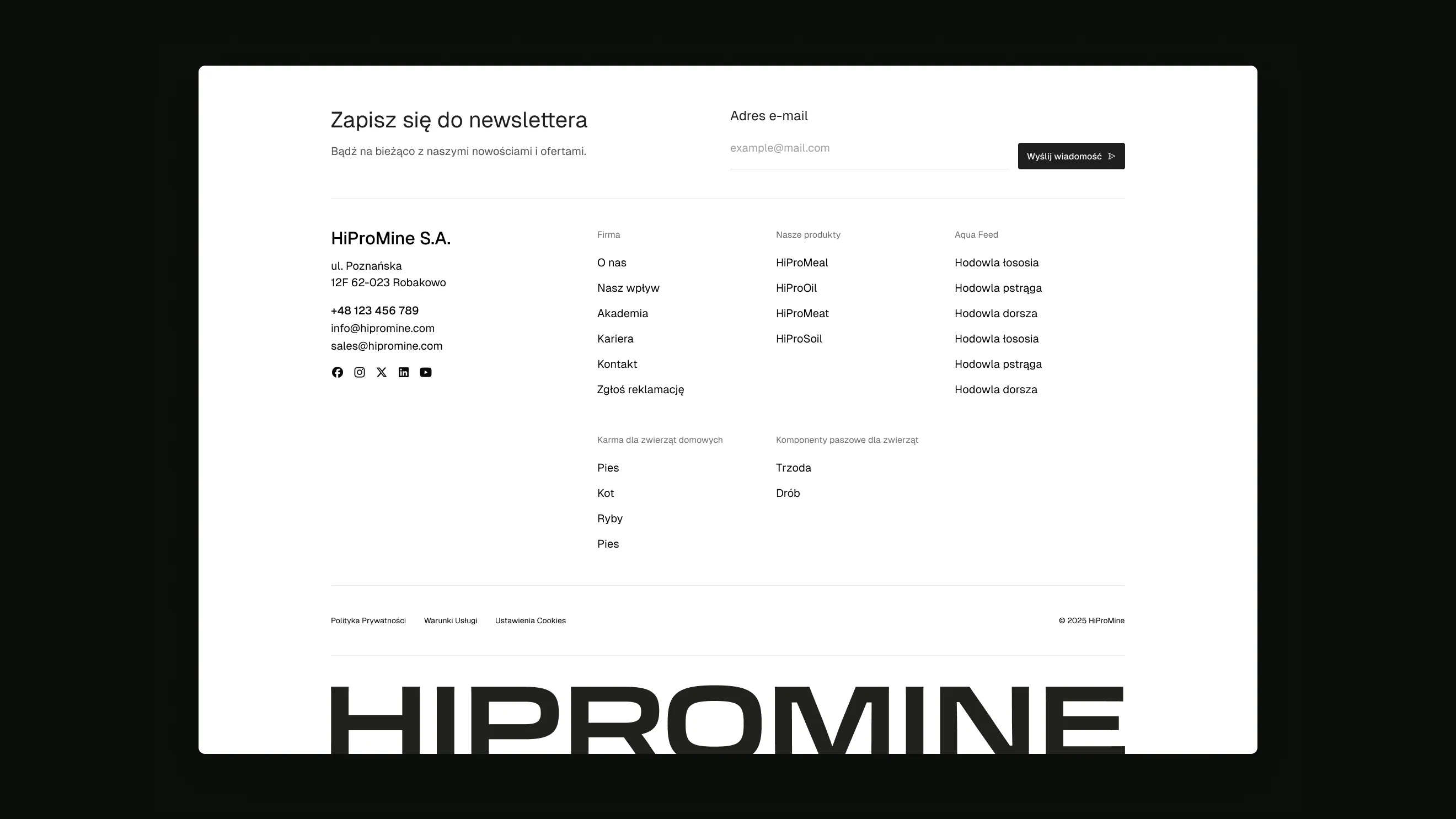
The structure starts from the buyer’s world instead of the product catalogue: farm, pet, fish or field. Products and articles sit one hover away from that choice, and the same groups carry through the hero tiles, the footer index and the mobile adaptation, so new ingredients and markets can be added without reworking the navigation.