All Aces Games
Brand and website, 2026
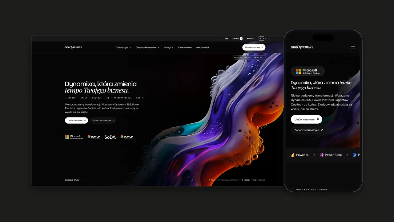
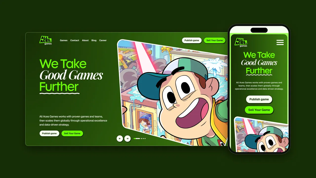
All Aces Games acquires, publishes and scales proven mobile games. After its rename from NovaSphere I designed the brand from the logo up, then the website and the social templates, so a pitch to studio founders looks as bright as the games themselves.
01 — Context
A new name for a growing publisher
All Aces Games, formerly NovaSphere, takes on proven mobile games and scales them with capital, user acquisition, live operations and data. Its portfolio includes Airport BillionAir Idle Tycoon, Idle Pet Shelter, Disaster Town Tycoon and Potions & Spells. The new name needed a whole identity: a logo and a brandbook, a website that explains the model to studio founders and uses the games as the proof, and templates for the social channels.
02 — Challenge
A business pitch that still feels like games
The people who matter most are studio founders deciding whether to hand over their game, so they need a clear deal and evidence. The products, though, are bright cartoon games. A sober corporate brand would hide the best argument, and a game trailer would bury the offer. The identity and the site had to keep both in view on every page.
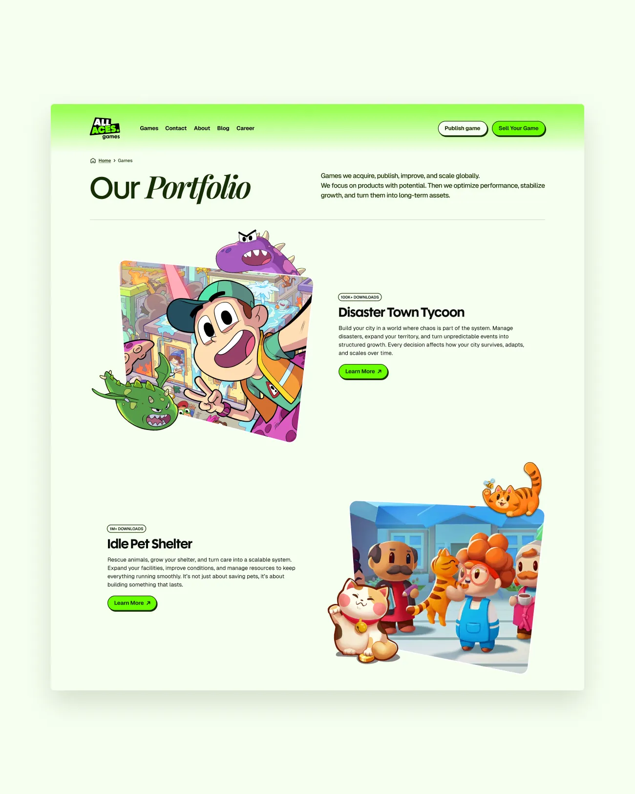
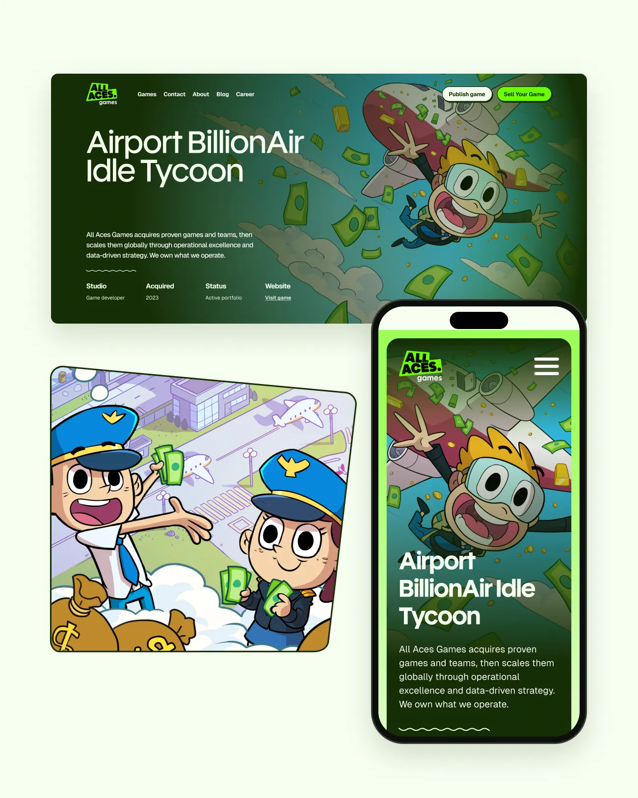
The games carry the energy; the two deal routes stay one click away on every page.
03 — Approach
Two routes, with the art as proof
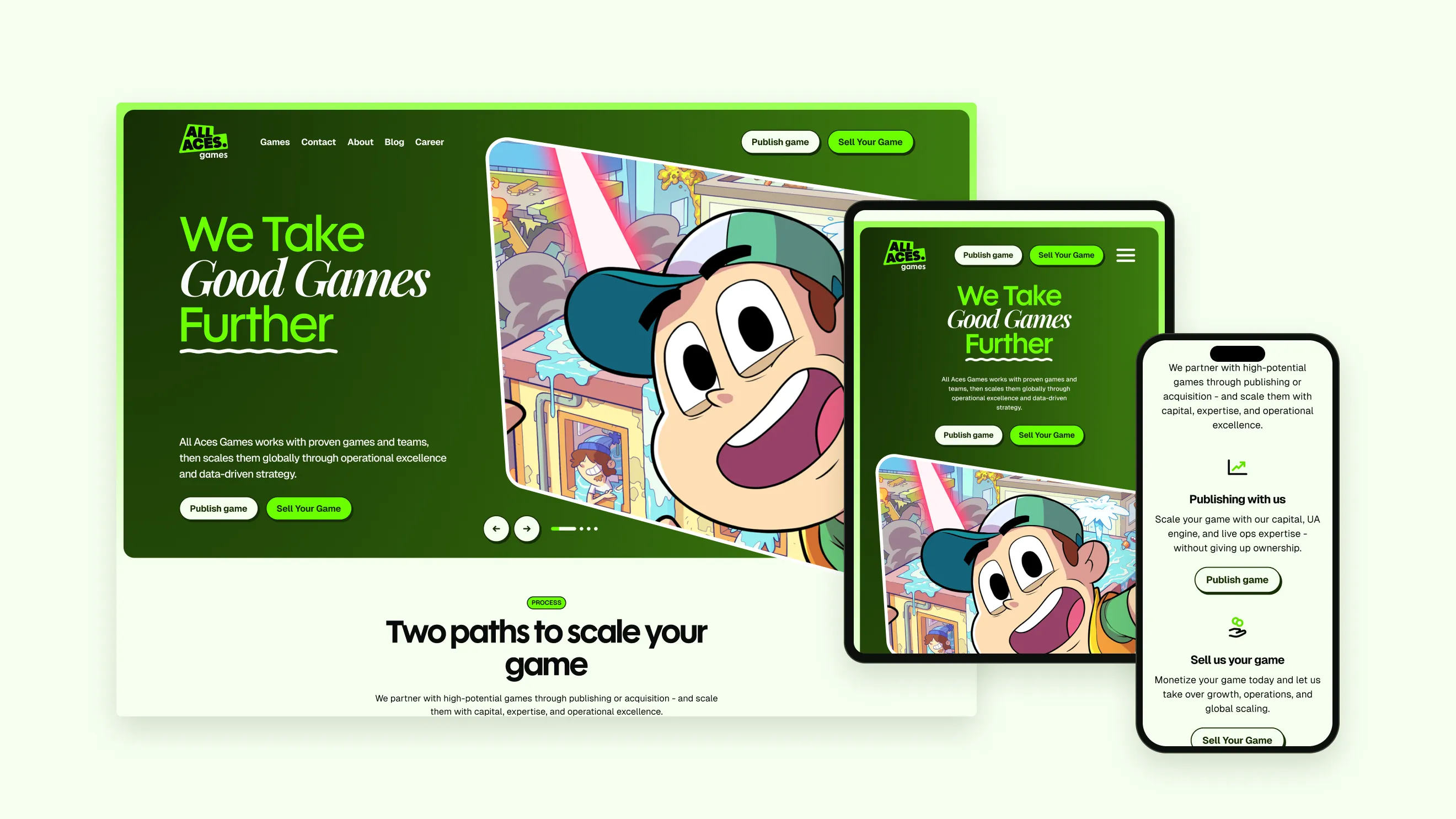
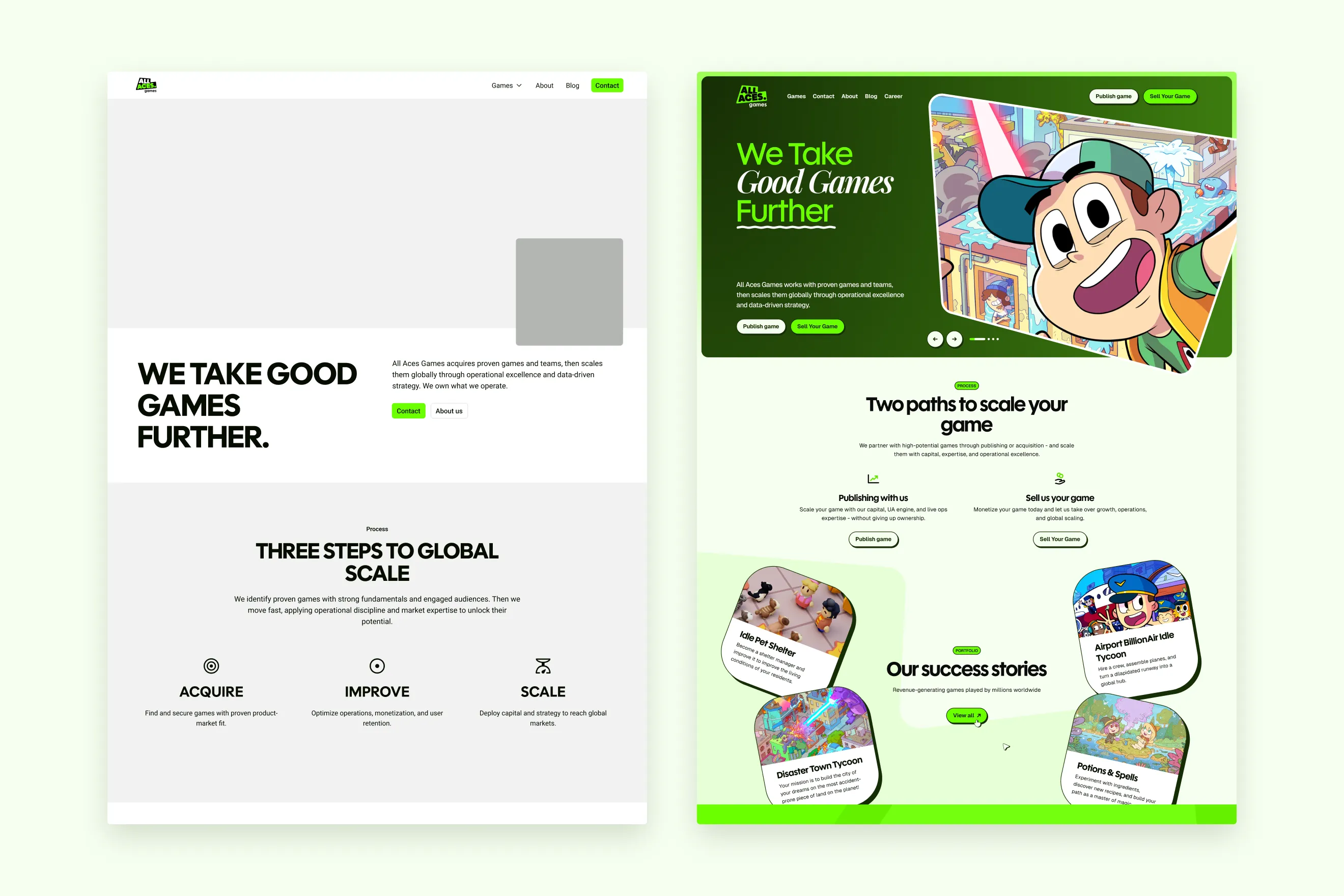
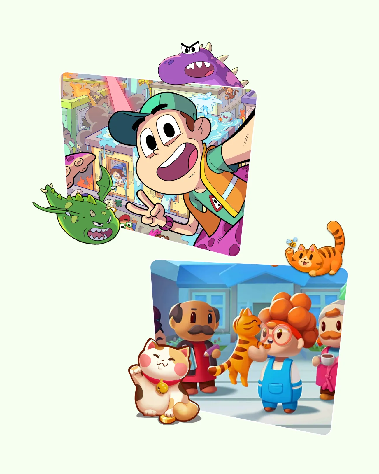
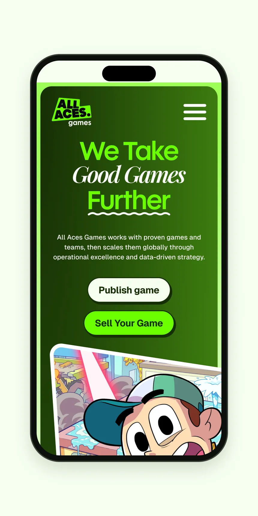
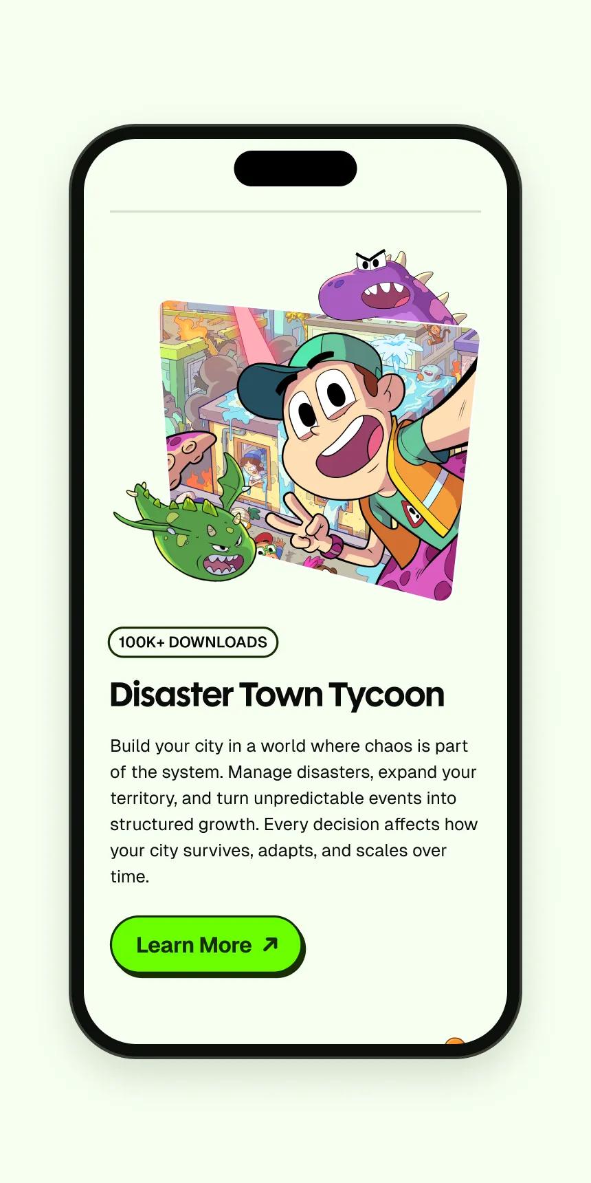
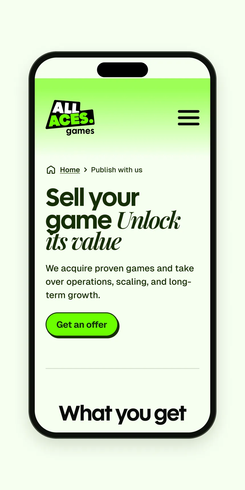
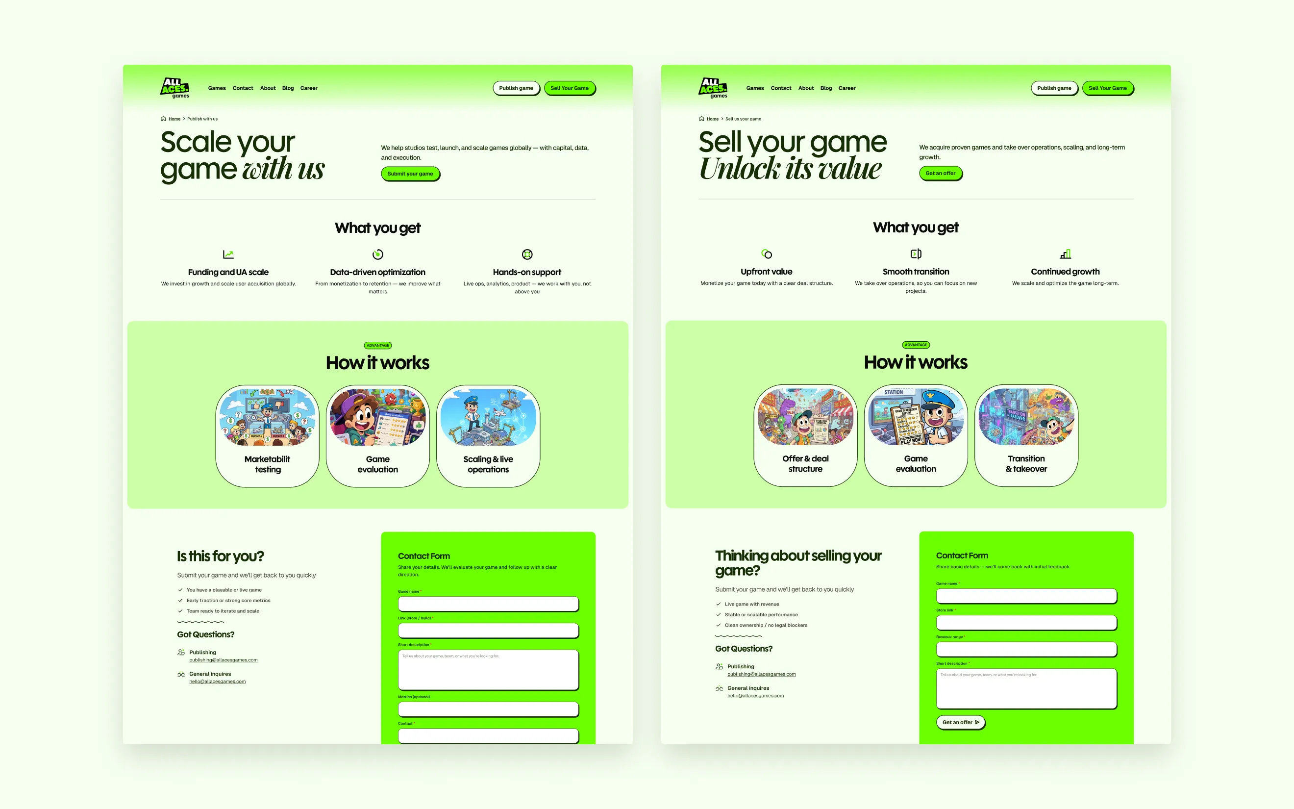
I started with greyscale wireframes of the core pages, from Home and the game pages to the blog and the privacy policy. The offer split into two explicit routes, Publish game and Sell your game. Both sit as buttons in the header and return on the home page under Two paths to scale your game, so a founder never has to dig for the deal. The games do the persuading: the hero is a slider of key art, and on the portfolio page the characters climb out of their frames.
04 — Deliverables
What shipped
- Brand
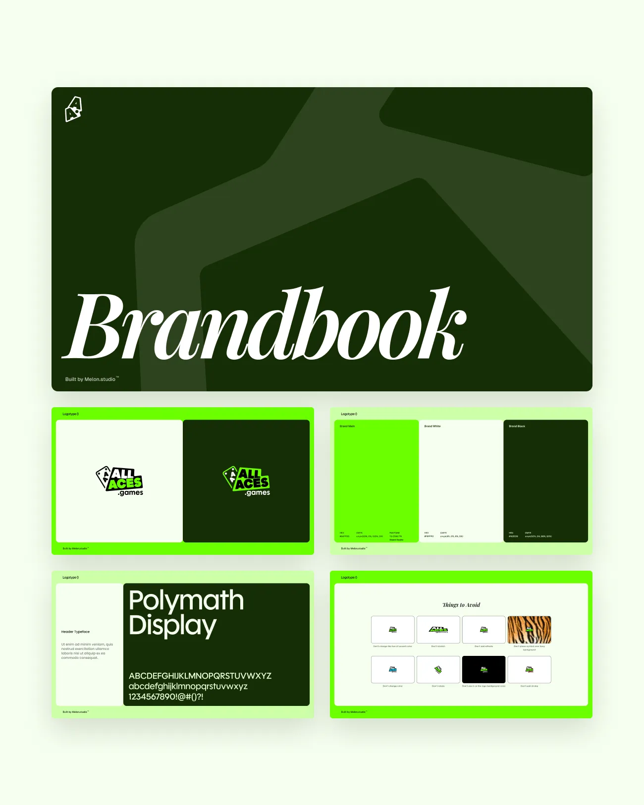
- Logo, logotype and sign in colour and monochrome; a brandbook with logo use, colours, type and things to avoid
- Pages
- Home, Games, game pages, Publish, Sell, About, Careers, Blog, Contact, each designed for desktop and mobile
- Studio routes
- Publish game and Sell your game, each with its own form
- Social
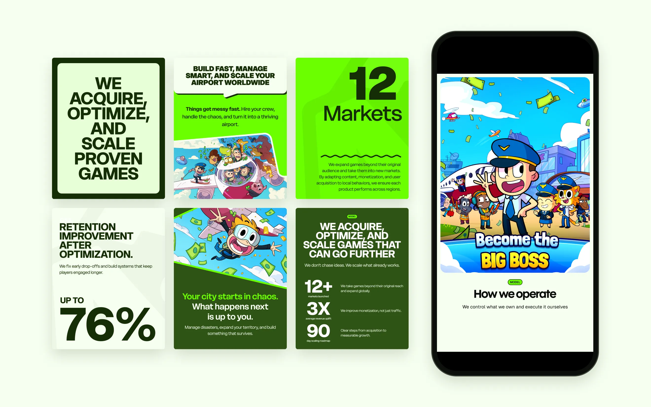
- Instagram post and story templates, Facebook and LinkedIn covers
- Type
- Polymath Display, Playfair Display italic, Geist
- Platform
- Built in Framer from my designs
05 — Brand
From five directions to a sticker
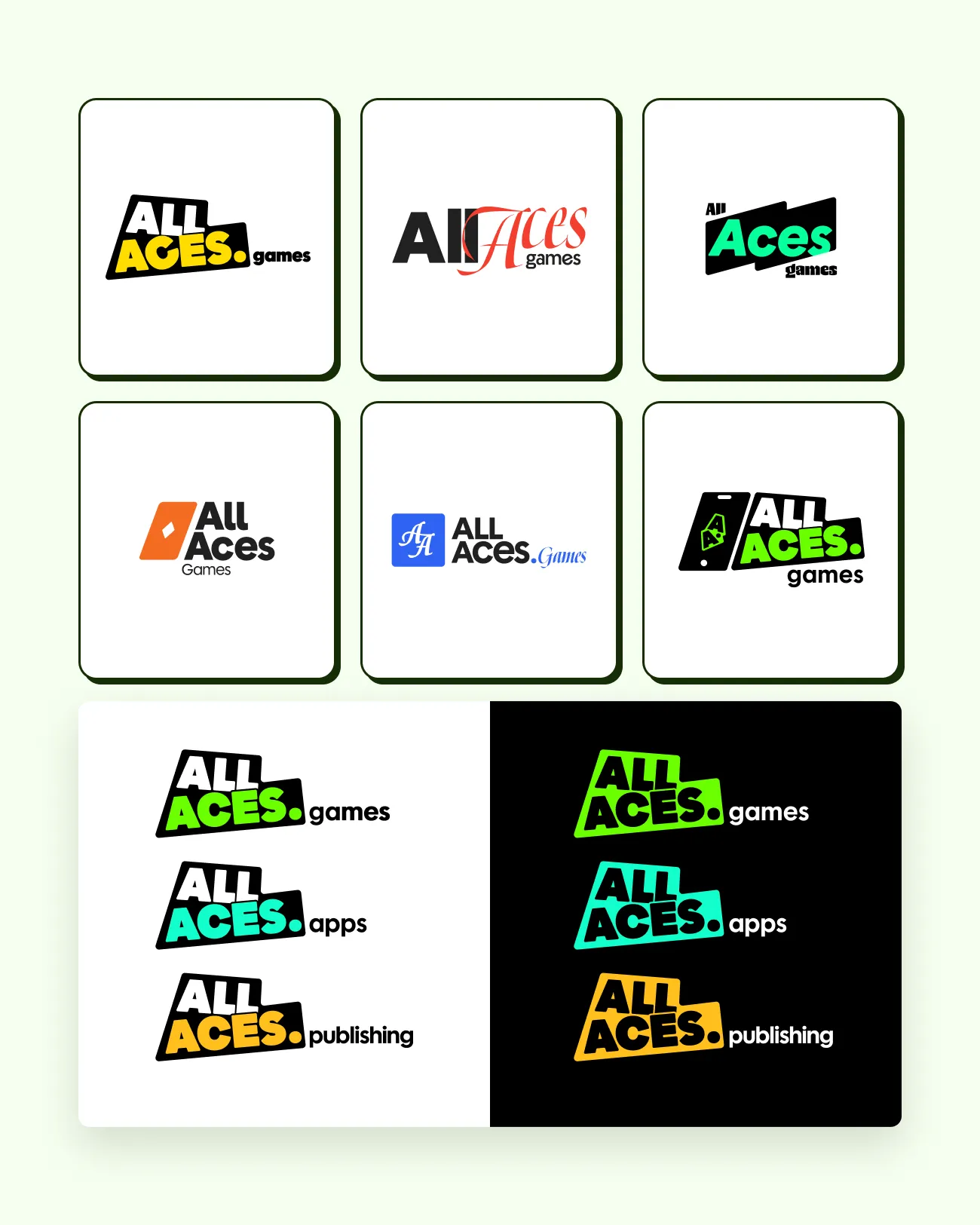
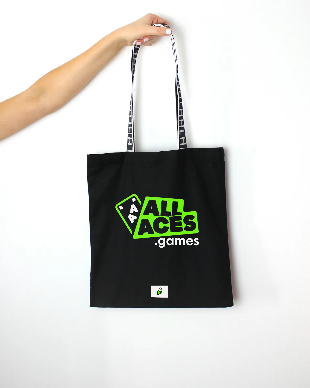
The logo started as five directions: a slanted sticker block, a serif script, angled bars, a diamond from the card suits and an AA monogram, plus a version with a phone in the mark. The sticker won and grew into a family for .games, .apps and .publishing; the final logo adds the aces as a tilted card beside ALL ACES on its slanted block. The palette comes from it: forest green for the hero and footer, acid green for buttons and statement bands, pale mint for the page. Headlines pair a heavy grotesque with one Playfair italic word, and cards and buttons share a dark outline and an offset shadow, which ties the cartoon art and the interface into one style.
06 — Outcome
A brand that plays and pitches
One identity now runs from the logo to the live site at allaces.games and the social feeds. Studios reach the two deal routes from any page, every game has its own page, and a new title slots into the same frame, portfolio row and post template without a new layout.