Bartergaz
Energy website, 2024
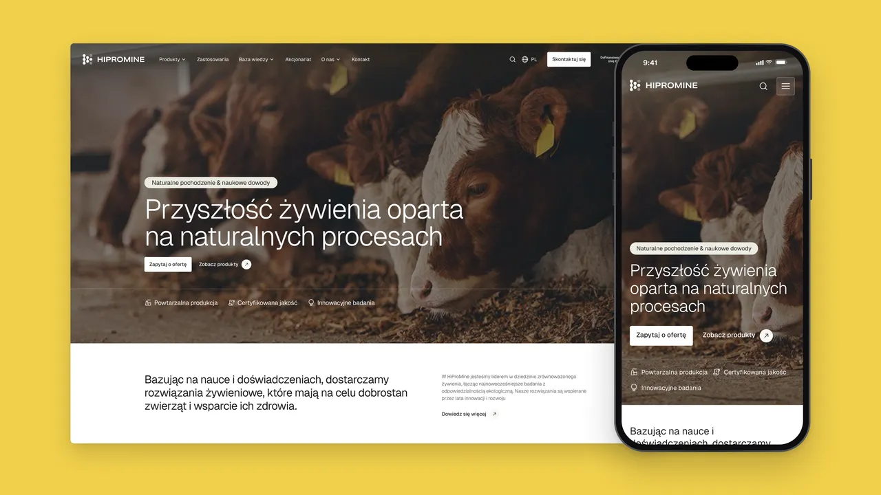
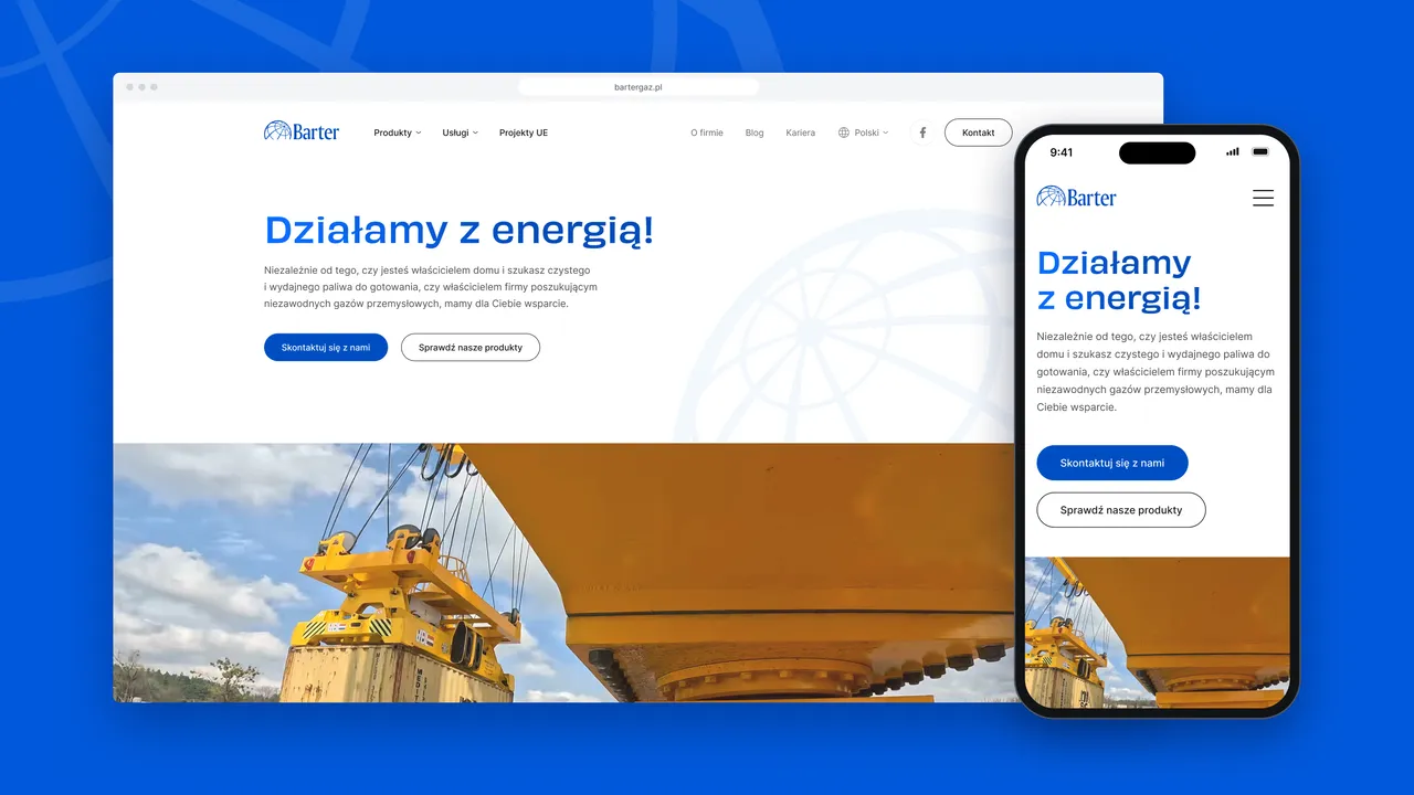
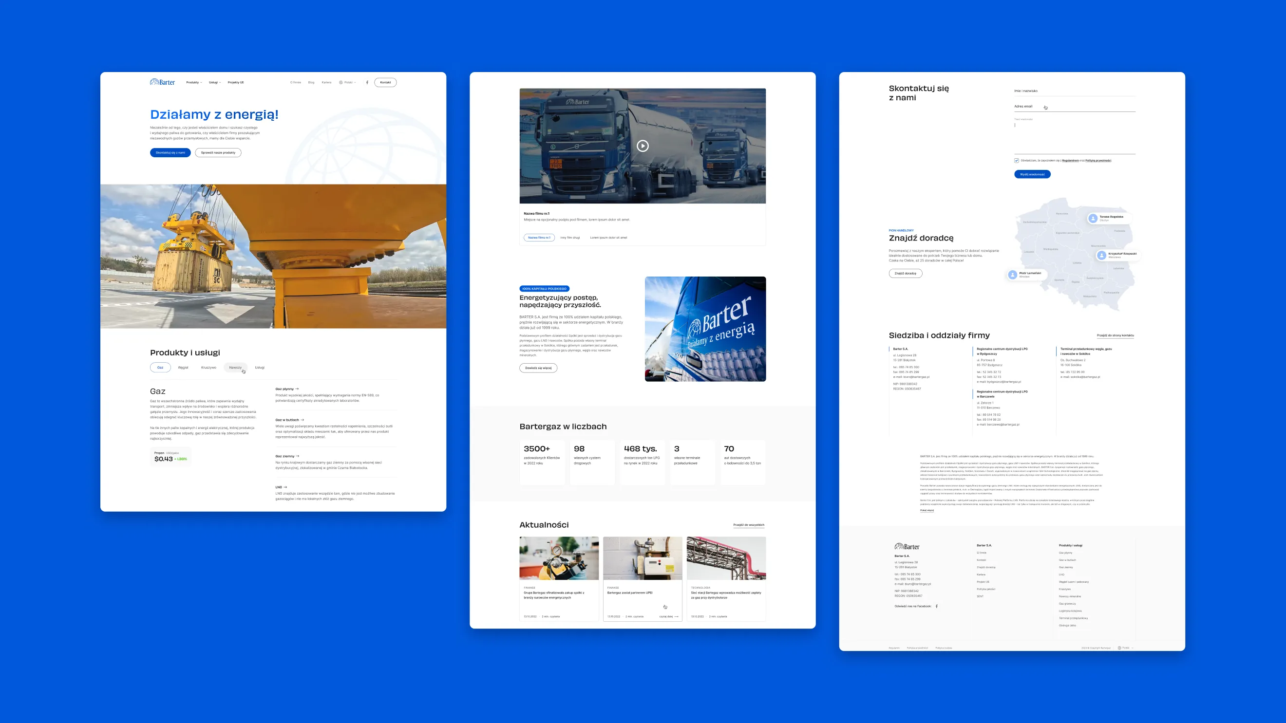
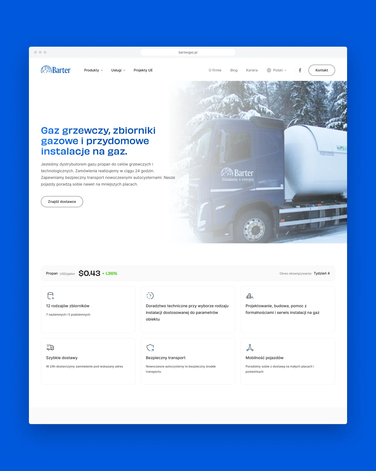
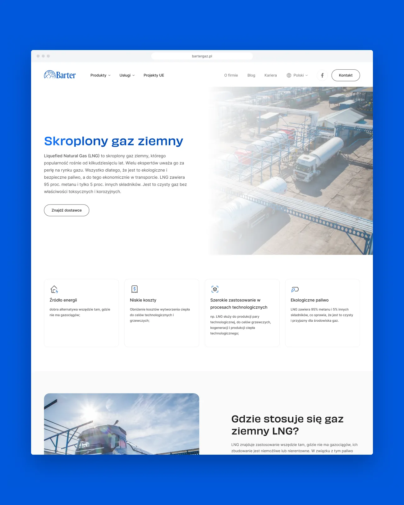
Barter supplies LPG, propane, LNG and network gas to homes and businesses across Poland. For WMC agency and Webmetric I designed the whole Bartergaz website, desktop and mobile, around one goal: getting each visitor to the right product and the right local advisor, then audited the build against the design.
01 — Context
A Polish energy company since 1999
Barter is a Polish-owned energy company that has been selling and distributing gas since 1999: autogas and LPG, gas in cylinders, heating propane, LNG and network gas, plus coal, aggregates, fertilisers, rail logistics and customs services. Customers range from households heating with propane to industrial plants running on LNG, and many of them are looked after by advisors responsible for a product and a region.
02 — Challenge
Many products, one right person
The offer is broad and technical, and the questions are personal: what does my home or plant need, and who handles my region? A single generic form would push all of that sorting onto the sales team. The new site had to help visitors identify the right product and reach the right advisor on their own, without reading a catalogue first.
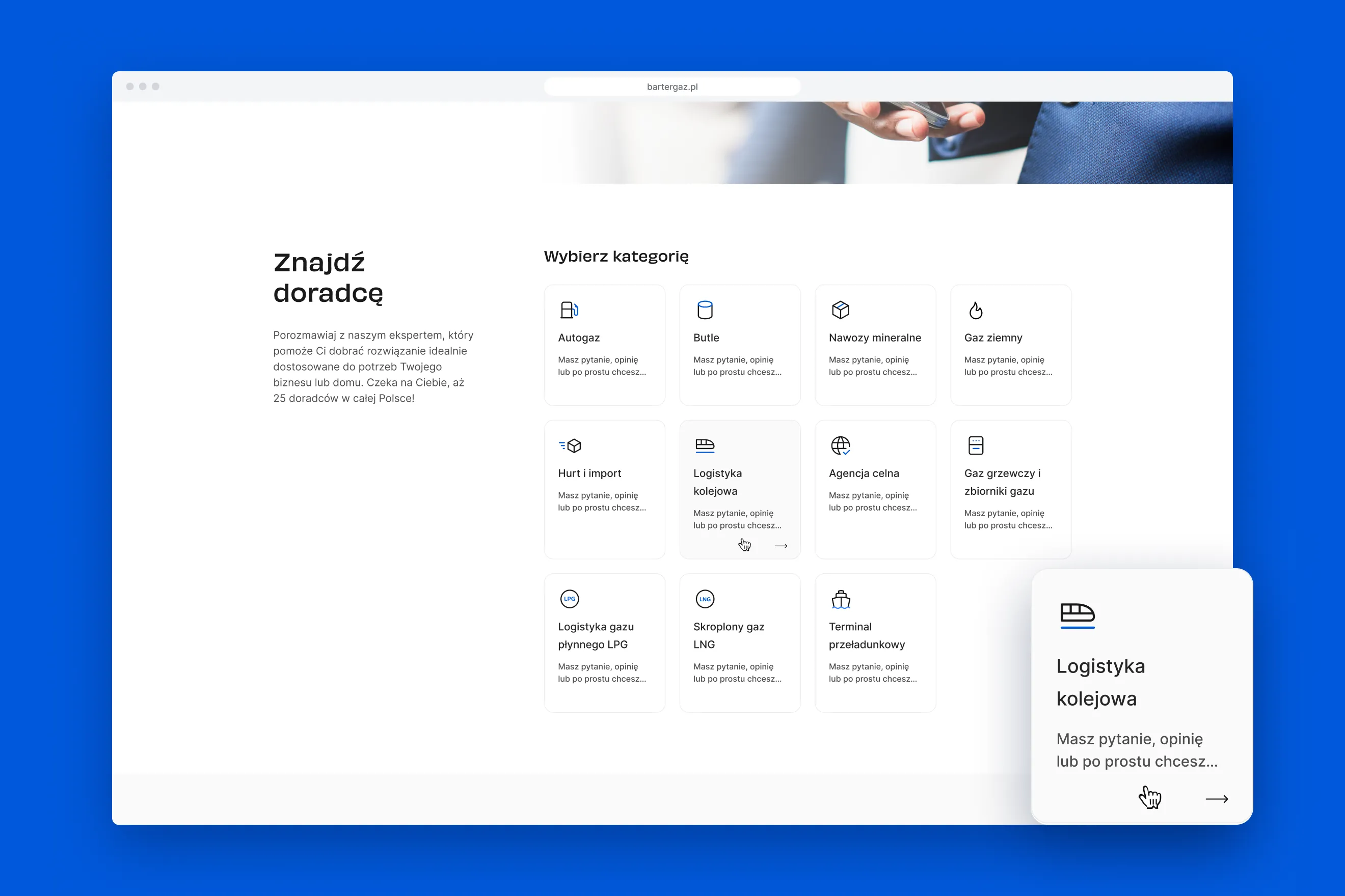
Pick a product, point at your region, and you get the people who handle it.
03 — Approach
Contact in three steps
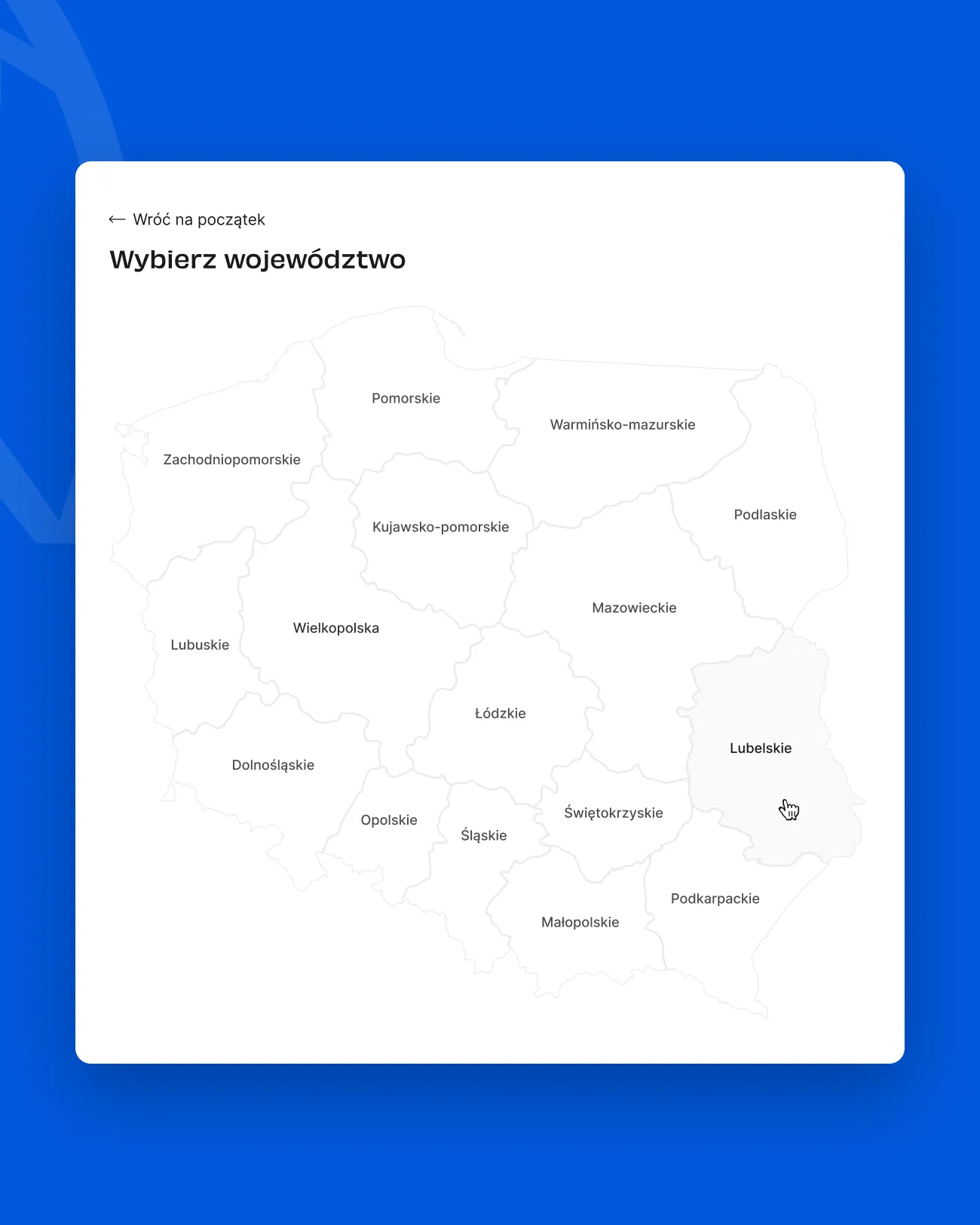
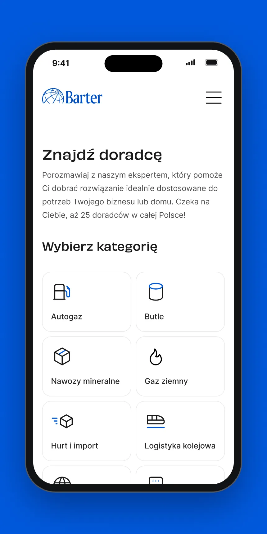
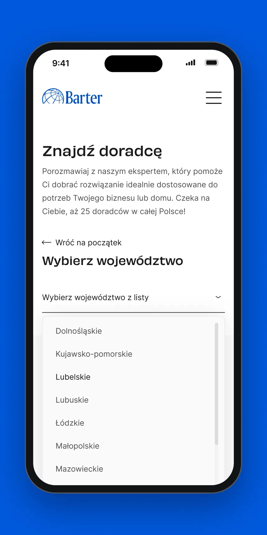
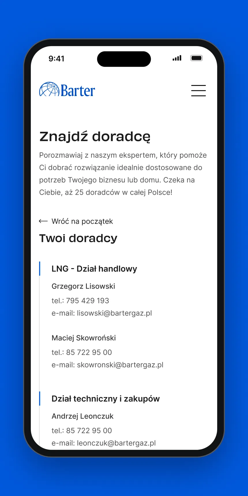
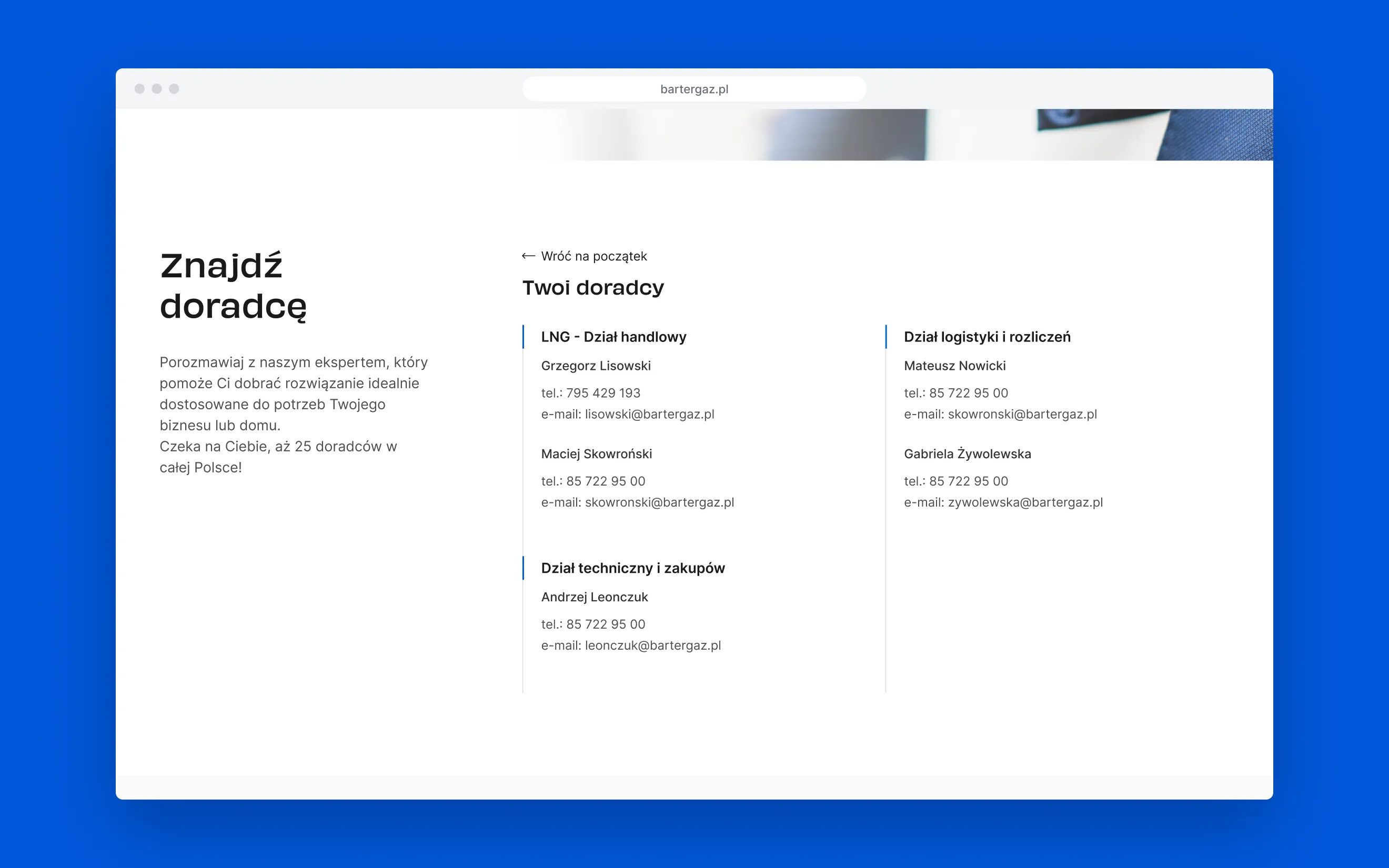
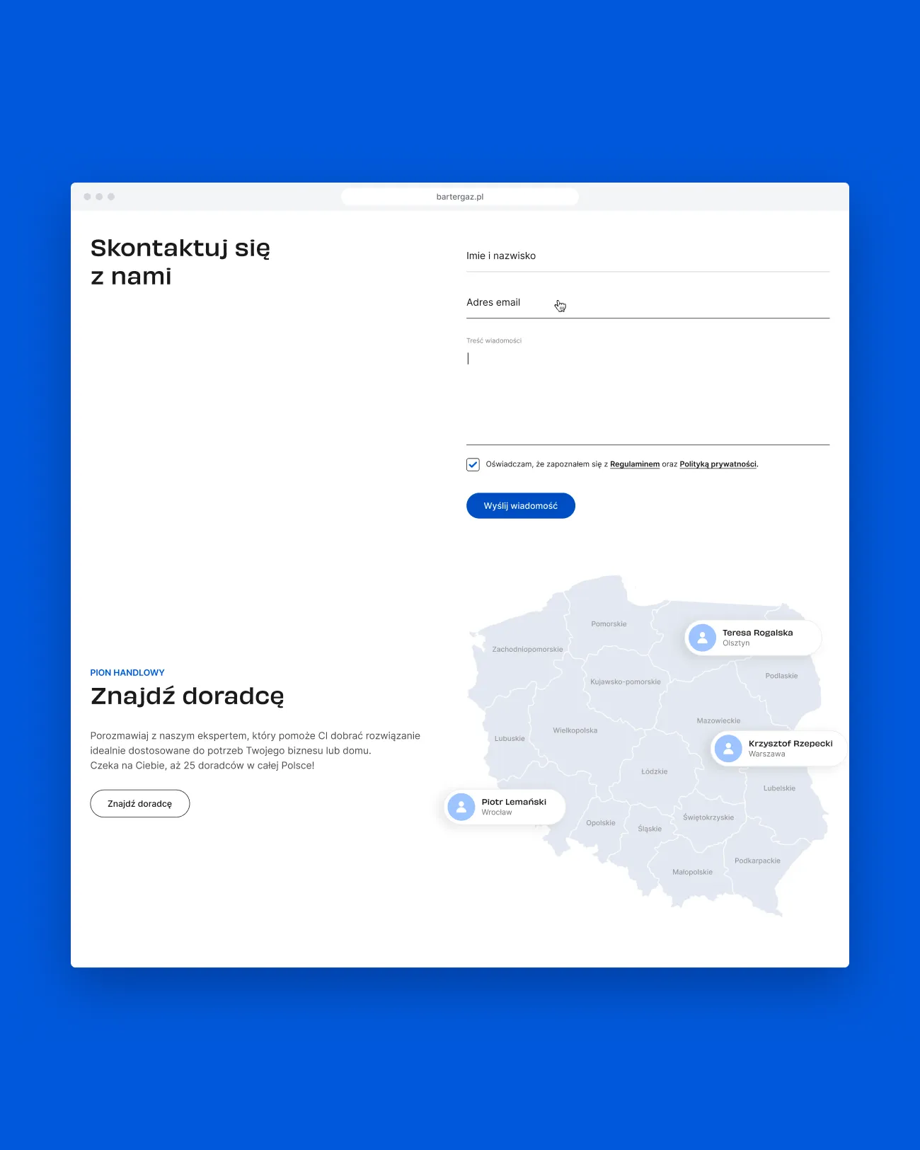
I turned the contact page into an advisor finder. First the visitor picks a category, such as heating gas or LNG; for products sold regionally they then pick their voivodeship, on a map of Poland on desktop and from a list on mobile; finally they see the advisors who cover it, grouped by department, with a direct phone number and email. A back link restarts the search at any point.
04 — Deliverables
What shipped
- Pages
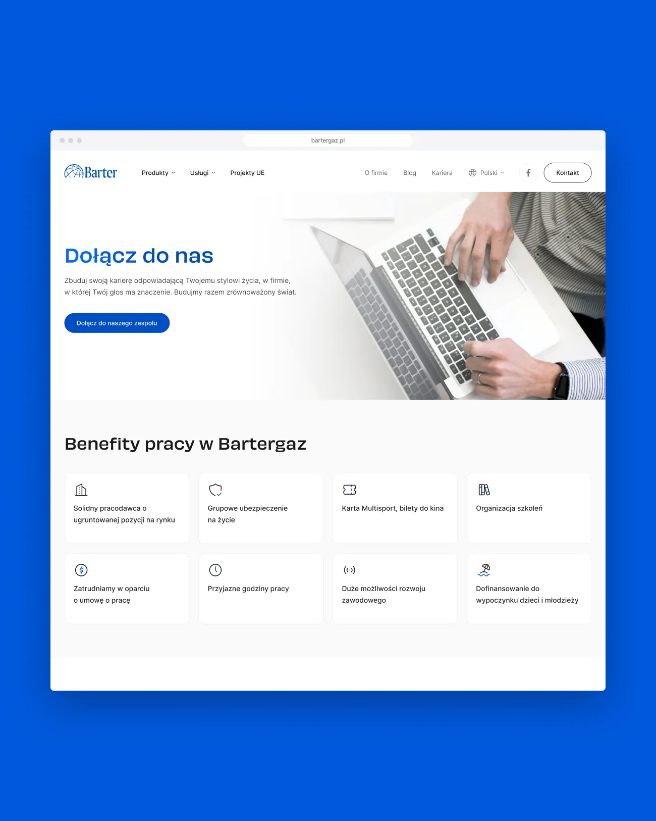
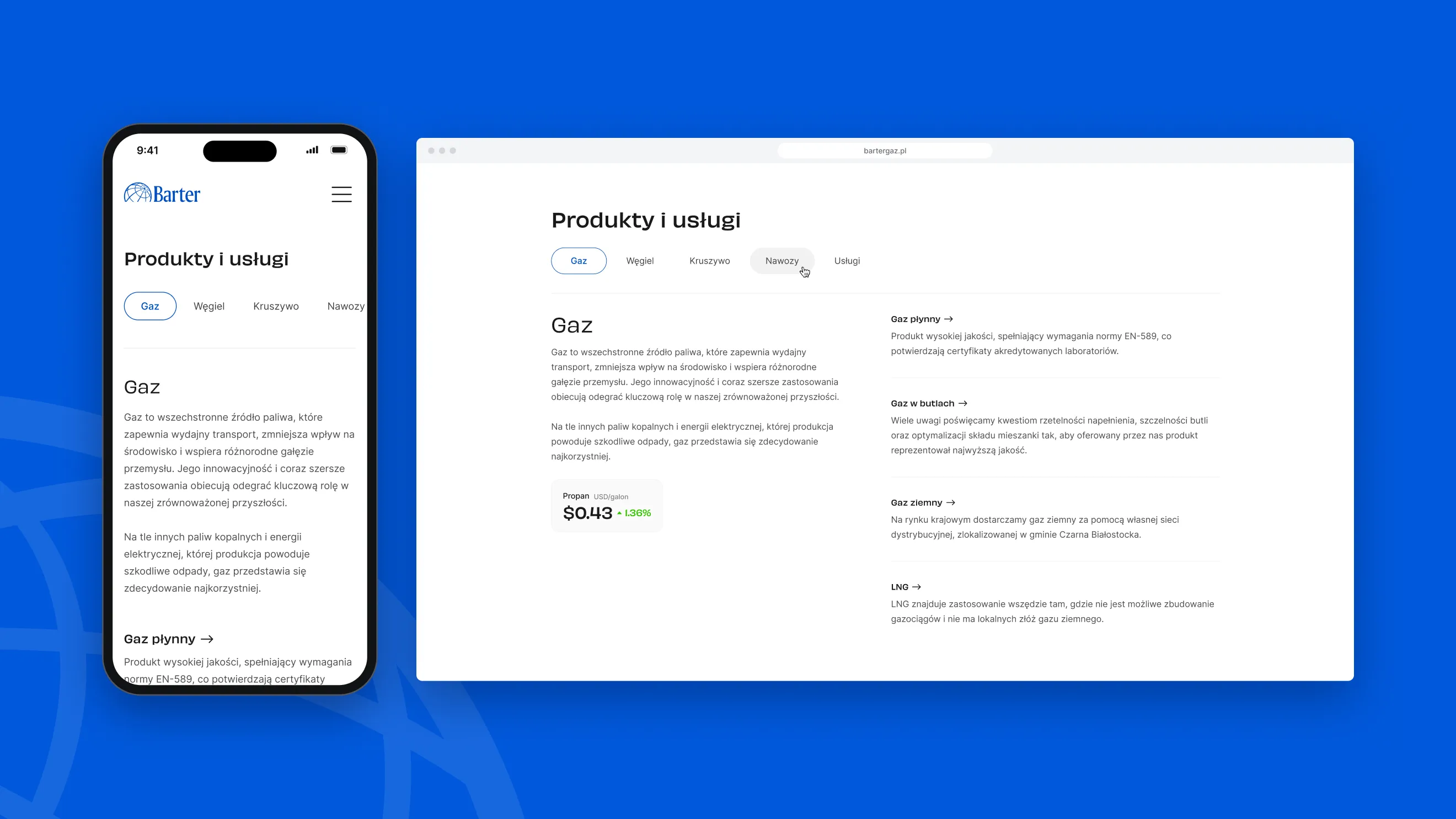
- Home, product pages, Contact, Careers, Blog, About us
- Contact flow
- Category → region → advisors
- Home sections
- Products, numbers, news, contact form, advisor finder
- Type
- Obviously and Inter
- Breakpoints
- Desktop and mobile
- Design QA
- Audit of the built site, with notes screen by screen
05 — Design system
Energy without the clichés
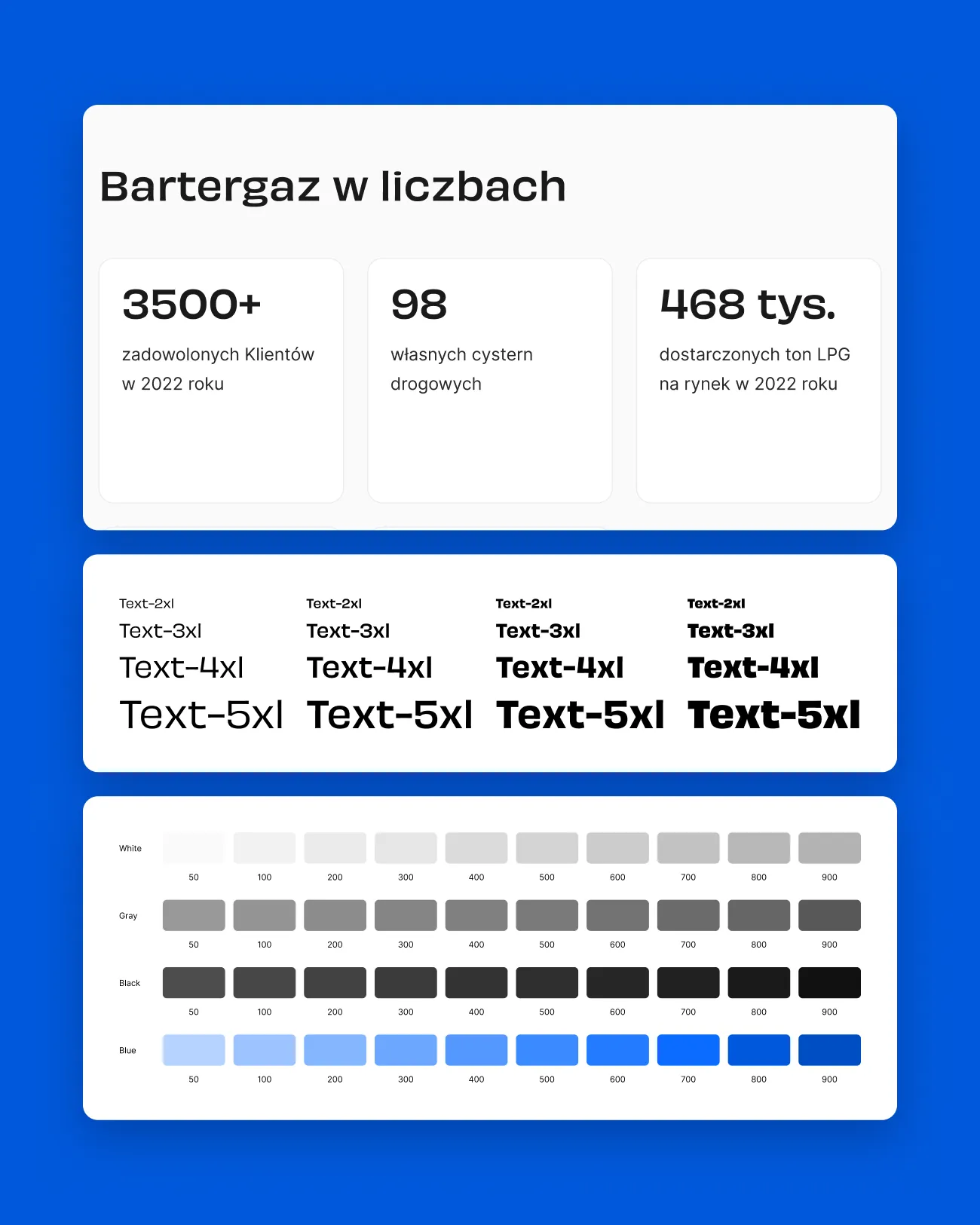
The site keeps a calm, white base and lets the Barter blue do the signalling: buttons, active tabs, highlighted regions and the thin rules that mark each advisor and branch. Headlines are set in Obviously, which gives the brand its energy, while Inter handles dense product, contact and address content. Numbers, news and contact categories share one outlined card style across the site.
06 — Outcome
From catalogue to guided path
The live site replaces a catalogue and a generic form with a guided path: visitors describe their need in two or three simple choices and end up with the phone number and email of the person who handles their product and region. The same structure works for a household and an industrial buyer, and the finder is one click away from the homepage, the product pages and the contact page. I also reviewed the built site against the design and documented the fixes screen by screen.