Mastercard Music
Product design, 2025
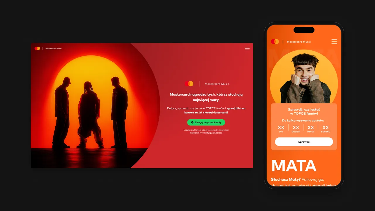
Fan-o-meter is a Mastercard Music campaign that rewards an artist’s most active listeners with concert tickets for PLN 1. I designed the campaign web app end to end, from the brand loader and the Spotify sign-in to the winner’s ticket code.
01 — Context
Listening as a way to win tickets
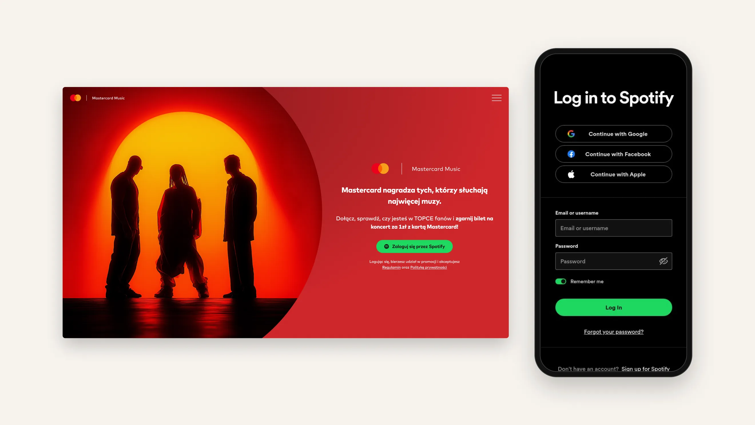
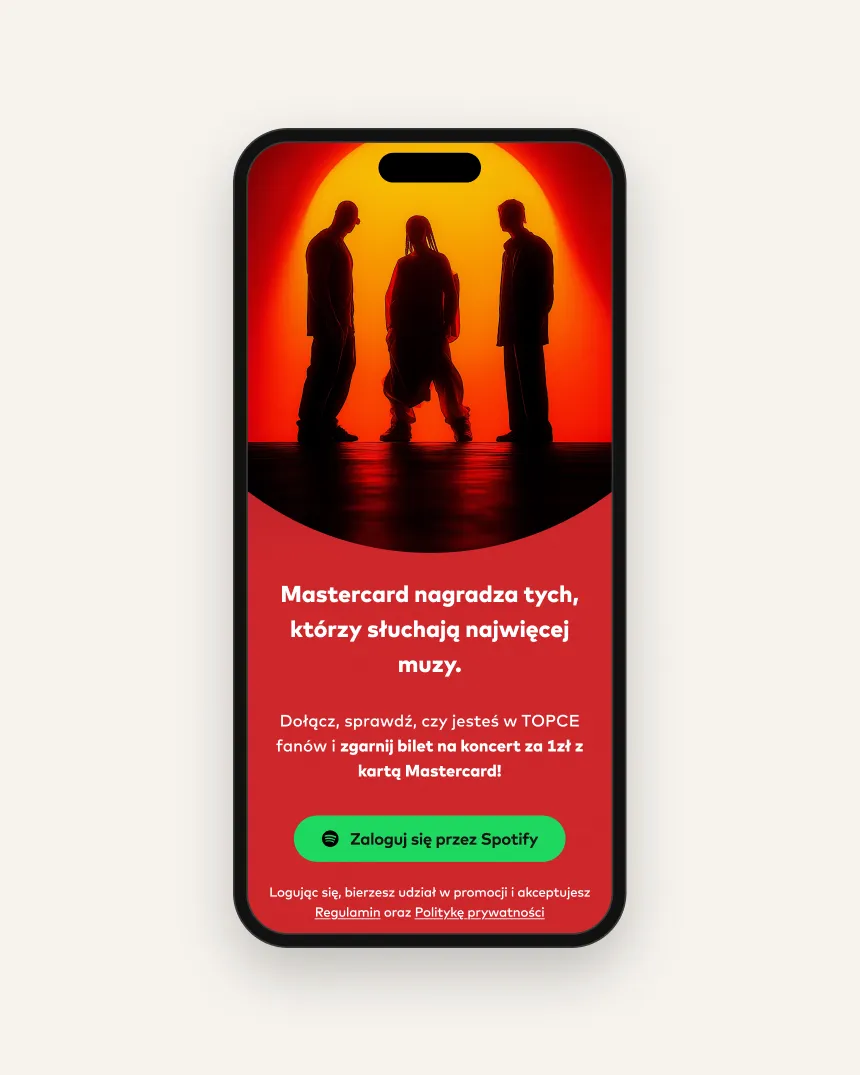
Fan-o-meter turns listening into a friendly competition. Fans log in with Spotify, follow an artist and listen as much as they can while the challenge is open. The most active listeners get a code for a concert ticket at PLN 1, paid with a Mastercard card and collected on the Going. ticketing platform. The campaign covers three artists, each with their own challenge.
02 — Challenge
Rules people understand in seconds
The mechanic has three moving parts — a Spotify login, a ranking nobody can see directly and a payment-card condition — and each of them is a reason to leave. The design had to explain the rules without a rules page, make the waiting feel like a challenge and make winning feel like an event, not an email.
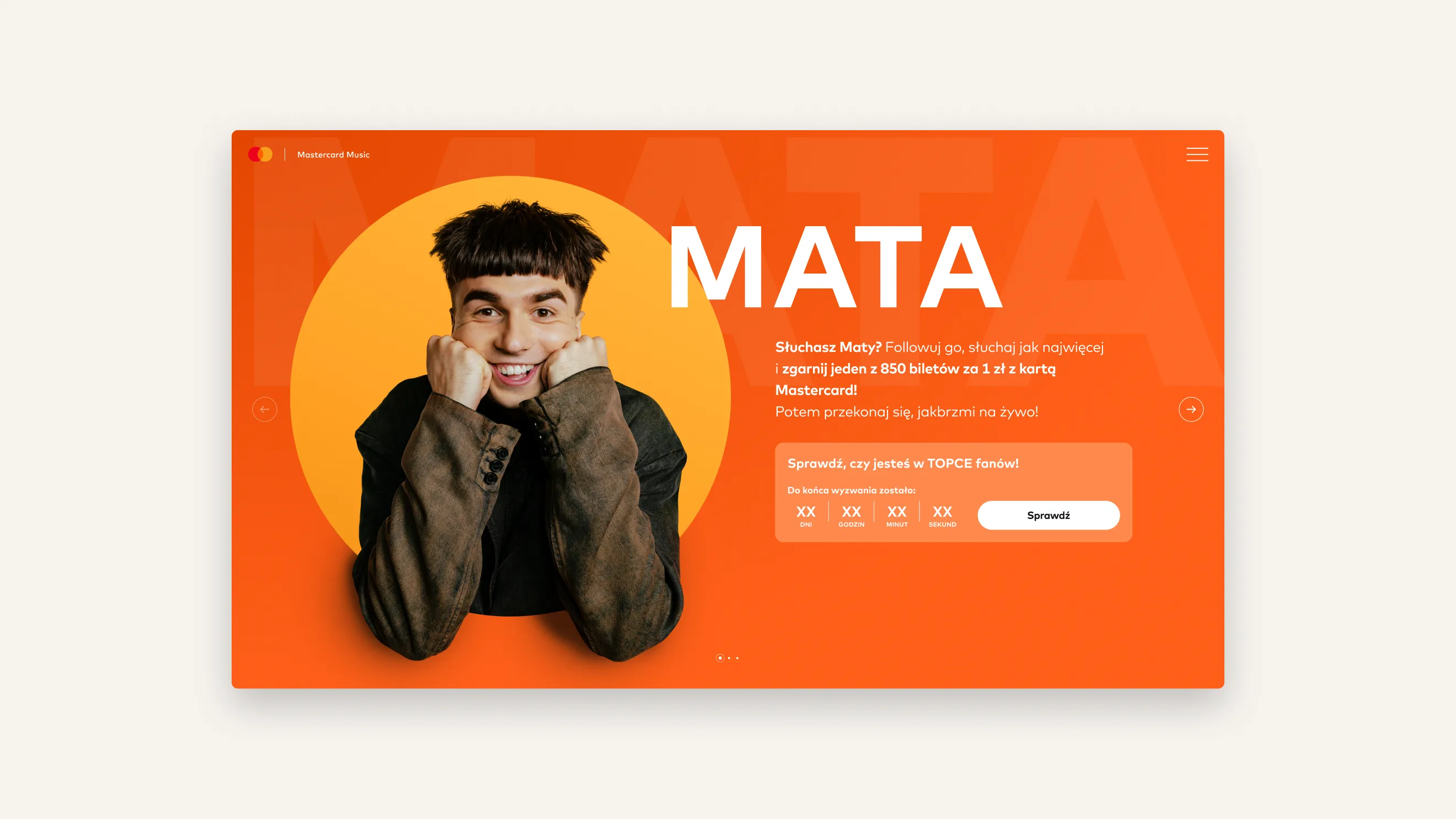
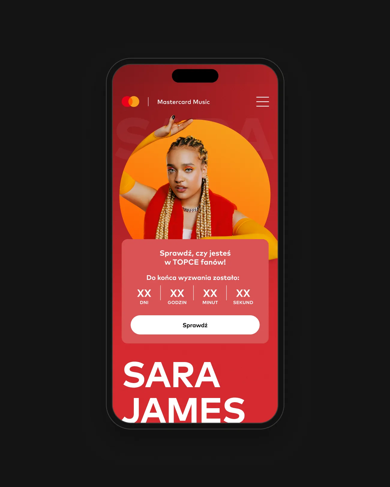
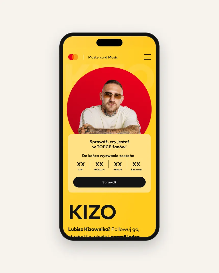
The campaign had three artists — Mata, Kizo and Sara James — so the same screens had to carry each of them, in their own colour, with their own portrait and countdown.
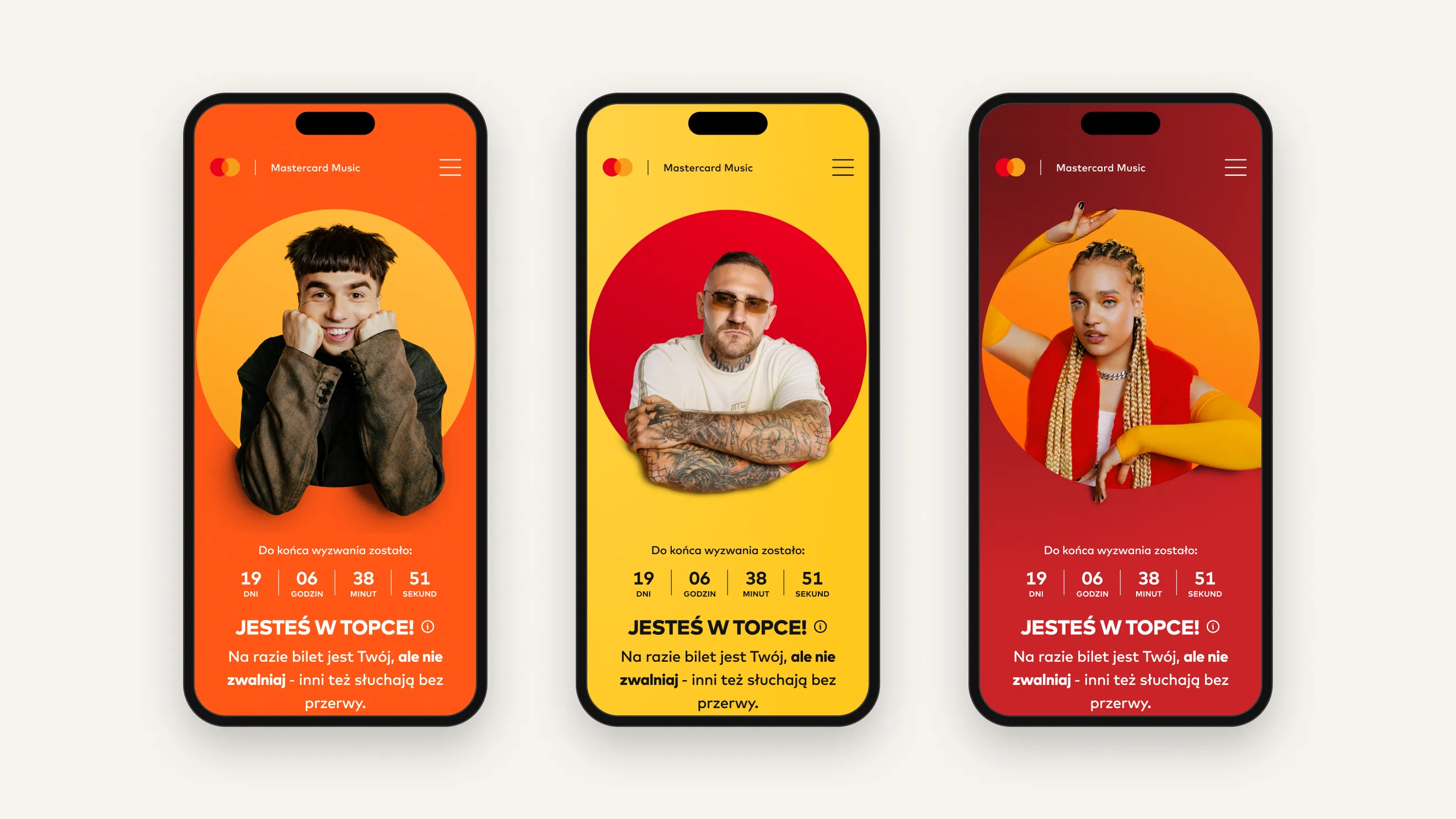
Every screen asks for one thing, and the button always says what happens next.
03 — Approach
Four screens, one decision each
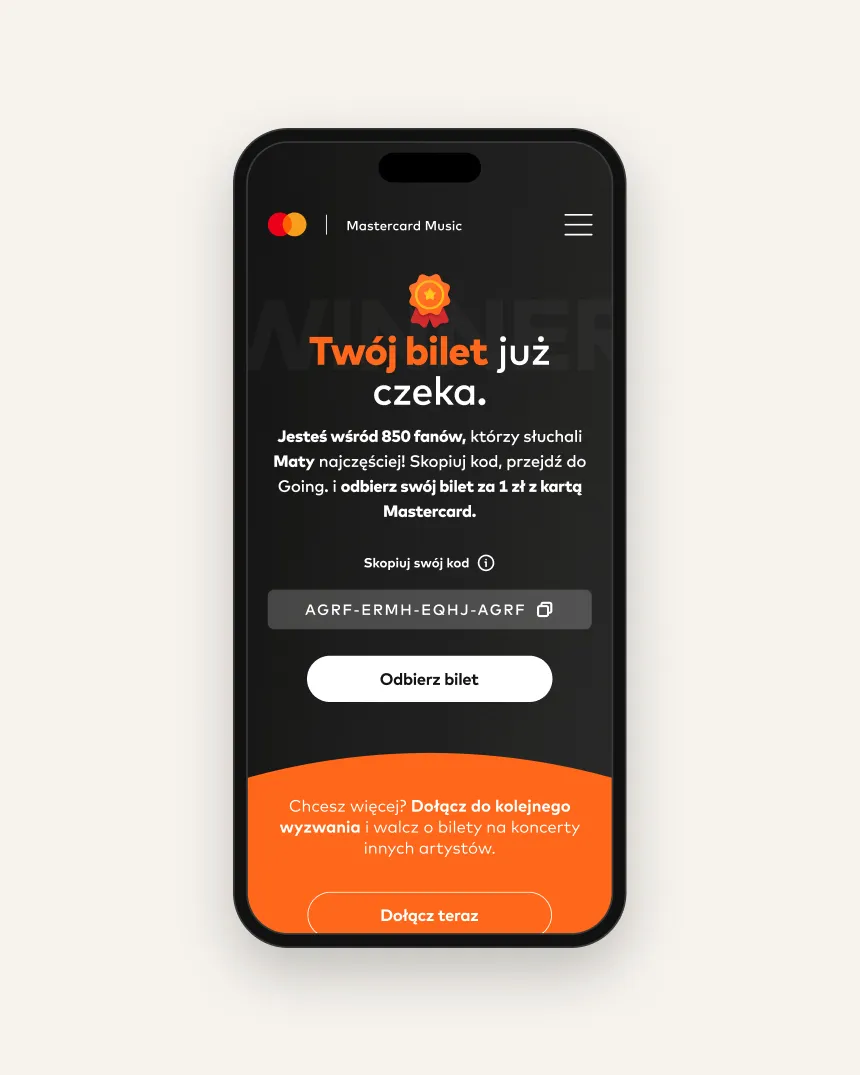
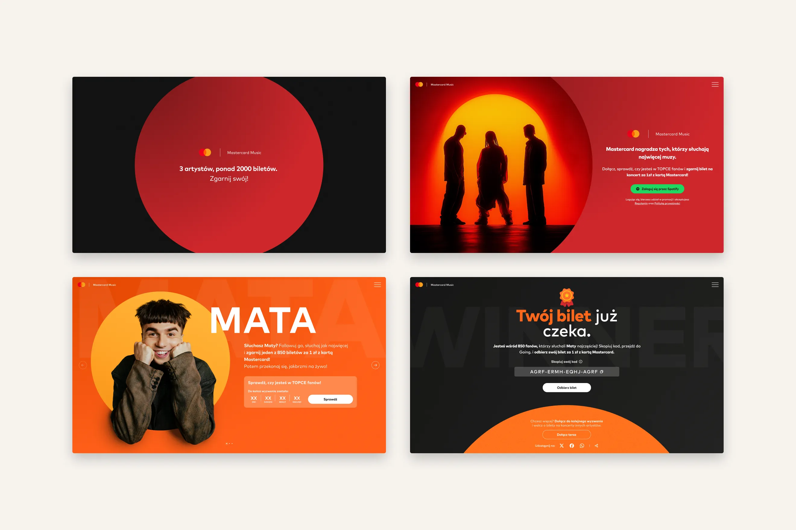
I reduced the journey to four states: loader, sign-up, artist page and winner. Every screen asks for one action and the button names it — Log in with Spotify, Check, Get your ticket. On the artist page a live countdown in days, hours, minutes and seconds gives the challenge a clear end and a reason to come back before it closes.
04 — Deliverables
What I designed
- Flow
- Loader → sign-up → artist page → winner
- Platform
- Campaign web app, desktop screens
- Hand-offs
- Spotify login, ticket pick-up on Going.
- Brand
- Mastercard Music, Mark For MC typeface
- Motion
- Animated brand loader
05 — Details
Brand-led, written for fans
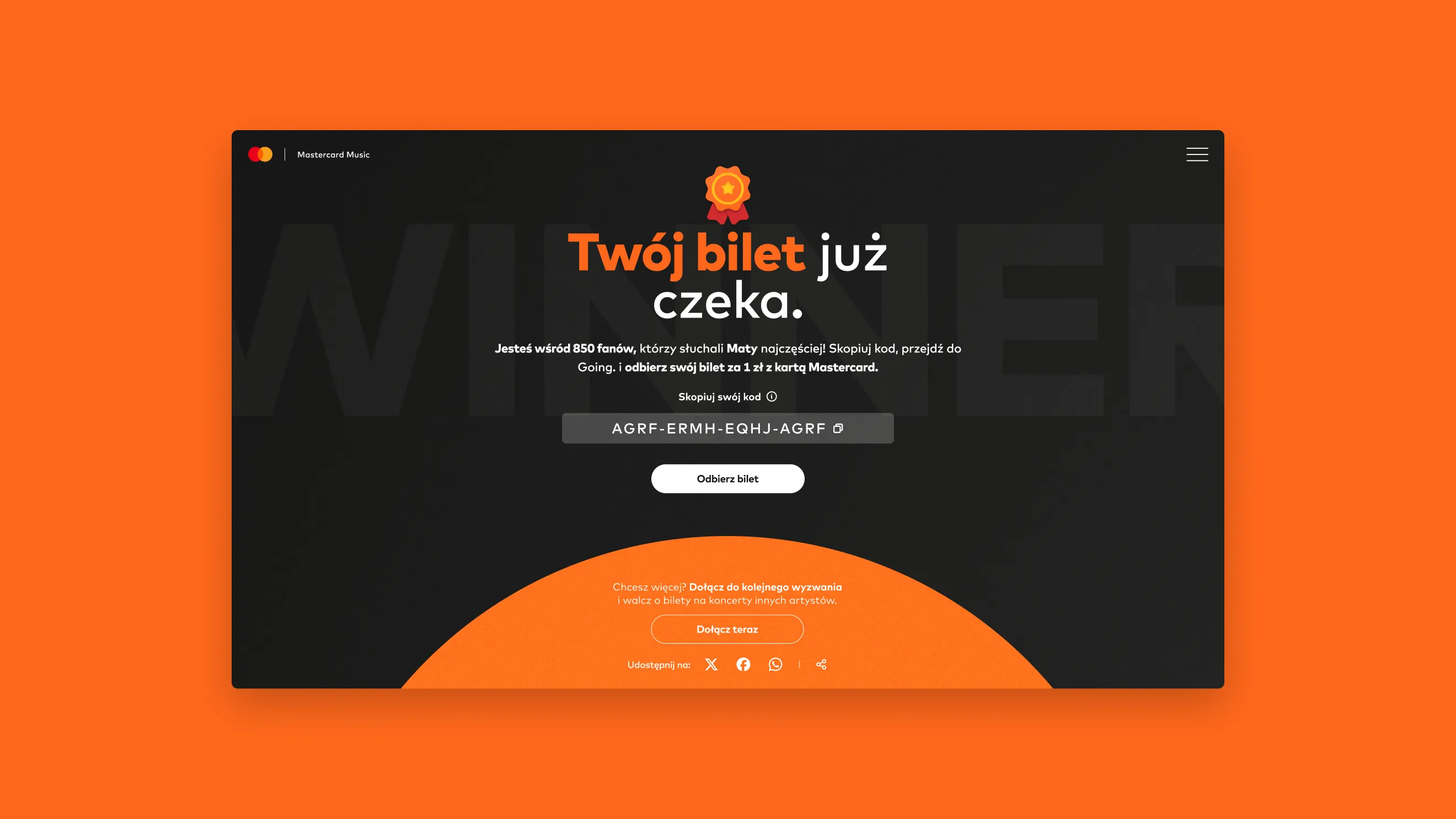
The visual language follows Mastercard Music: brand orange and red, the circle as the main shape and the Mark For MC typeface. The copy speaks like a friend rather than a bank — “Listening to Mata?” puts the artist first and the card condition second. On the winner screen the ticket code gets its own field with a copy icon, because it is the one thing the winner has to carry over to Going.
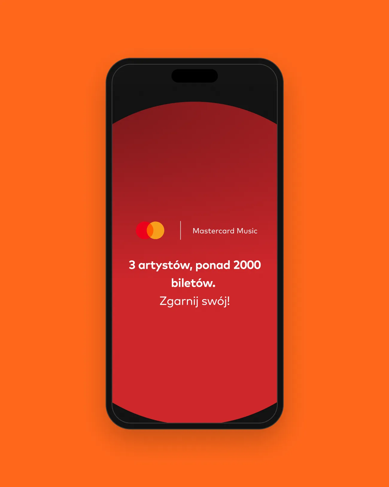
Winning should feel like an event, not an email.
06 — Outcome
A campaign flow with no dead ends
Every state, including winning, points to a next step: collect the ticket, share the result or join the next artist’s challenge. Because the screens are built around the mechanic rather than one performer, the same system works for each artist in the campaign — only the portrait, the name and the copy change.